今日推薦開源項目:《666 SixClear》
今日推薦英文原文:《We』re Killing the Mobile Web》
今日推薦開源項目:《666 SixClear》傳送門:GitHub鏈接
推薦理由:難得的 666 期當然要來一個 666 的項目啊。這個項目是一個名字就叫做 666 的六邊形消除遊戲,把六邊形擺到平台上然後三消的玩法看似簡單,但是玩到後面沒有規劃的話總是會被封死……希望這個 666 能夠幫助各位新年都變得 666 起來。

今日推薦英文原文:《We』re Killing the Mobile Web》作者:Danny Moerkerke
原文鏈接:https://medium.com/better-programming/were-killing-the-mobile-web-be5c5662c807
推薦理由:現在的趨勢的確是移動端應用佔了上風,但是移動端網頁的潛力依舊存在
We』re Killing the Mobile Web
But we may be able to save it as well
Has this ever happened to you?You』re browsing the web on your mobile phone or tablet and a banner appears on the top of the screen, urging you to install the site』s native app. This is the first time you ever visit this website, and so you decide not to install the app.
But when you visit the website a few more times, the banner keeps appearing, and after a while, you decide to give their native app a try.
You go to the store and download it. You open the app and start to use it. But you notice that what the app offers isn』t very different from what you got on the website.
But the user experience is better. There are no white screens when you go from page to page, and when you open the app, it launches immediately.
So you decide to use their native app instead of their website, even though it takes up tens of megabytes of storage on your mobile device and you regularly get nagged by endless updates.
Actually, speed and a better user experience are the main reasons people prefer native apps over mobile websites.
In fact, users are willing to go through the hassle of installing a native app and giving up storage space on their device just for the convenience and good user experience native apps provide.
And that』s a shame because the mobile web has strong advantages when it comes to ease of use, size, and discoverability, but this has no value when mobile websites offer a bad user experience.
The Web Can Do Much Better
Many native apps can easily be replaced by a well-crafted mobile website and offer the user the exact same, or an even better, user experience.But instead, we offer a lousy user experience or no experience at all when we chase them away and tell them to install the native app instead.
That』s why the two main reasons users prefer native apps over mobile websites are user experience and speed. These are the areas where our mobile websites need to improve if we want to make the web relevant on mobile. Because right now, the mobile web is simply not relevant.
A whopping 90% of the time people spent on their mobile devices is spent on apps, and a mere 10% is spent on mobile websites. This is in stark contrast to desktop, where web-based applications are a huge success.
Why are we not able to achieve the same success on mobile? Here are some reasons:
We』re Actively Chasing Users Away
The nagging banners that we put on our mobile websites to urge people to download our native app are hurting the mobile web. The message they convey is that this website is not good enough to view on your mobile device and we didn』t even bother to make it better.Instead, we want to hog another ~100MB of your phone』s storage to give you the exact same experience we could』ve given you with a mobile website, but we didn』t.
What』s wrong here?
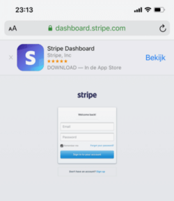
It』s not my intention to pick on Stripe in particular, but their native app doesn』t offer any added value compared to their website. Yet the website is practically unusable on mobile devices, starting from the tiny login screen.
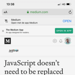
The same is true for the native app of this website, Medium.
On the mobile Medium website, you』ll see a banner telling you to install the native app. After clicking it away for a couple of months, I finally decided to give the native app a try.
It』s a 58MB app that basically gives you the same experience as the mobile website. The only added value it brings is that it enables you to write a story, which isn』t possible with the website on a mobile device.
For some reason, it』s not possible to reply to a comment from the native app. And when the number of claps for a story is, for example, 1,256, it will simply show as 1.2K with no option to see the exact number.
On top of that, the banner that shows on the mobile website doesn』t go away after you』ve installed the native app.
Even worse, now a second banner shows up, urging you to open the native app.
Really, Medium?
Responsive Design Should Be Mobile First
It』s not enough to view your website in the responsive view of your browser』s dev tools and shoehorn it into the smaller screen of a mobile device. This basically reduces it to a dumbed-down version of the desktop website.We need to get out of the 「desktop first」 mindset and start developing for mobile devices first. Our users are increasingly on mobile devices, and many are on mobile devices only.
A 「mobile-first」 design will ensure we』ll design for a complete user experience on mobile devices that can then be augmented for desktop. We shouldn』t design for desktop first and then take away features just to fit it on mobile devices.
This is a subtle yet crucial difference.
But making sure your website looks good on a small device isn』t enough either. You need to actually experience your web app on a mobile device, and that means testing your app on a real device under real conditions.
What runs smoothly on your fancy development laptop might not run so smoothly on a cheap Android phone on a 3G connection. Not everybody has the latest iPhone or Samsung phone (in fact, the majority of people don』t).
Mobile-first means your users get the best user experience possible on a real mobile device under real conditions.
Too Much JavaScript
This also means we really need to cut down on the amount of JavaScript we send to our users. In the last decade, the amount of JavaScript we send has increased by about 636% to a median of 385KB gzipped.Now, 385KB might not seem like an awful lot, but keep in mind that this unzips to around 2.5MB of JavaScript that needs to be parsed and executed as well. And that takes place on the main thread, which means it』s render-blocking.
Sending that amount of JavaScript to your users on an average Android phone on an average 3G network just doesn』t cut it. It may take your site tens of seconds or even a minute to reach Time to Interactive, which basically makes it unusable on those devices.
You can see for yourself how your site performs on mobile devices under real network conditions.
We Misunderstand 「Offline First」
Designing your web app for 「offline first」 doesn』t mean that your app should provide the exact same user experience when users are offline.It means that your users are increasingly on mobile devices, and mobile devices can have slow and intermittent connections. A native app will just launch and show a default screen with some (stale) content that will be updated as soon as the connection is back.
Most web apps will leave the user looking at a white screen for a long time or just fail. This is one of the two most important reasons users prefer native apps over web apps: The user experience of web apps is simply not good enough.
Native apps have the advantage that they don』t need to download their UI or scripts before you can use them. Everything is already installed and the only thing they basically need is data.
Web apps can now accomplish the same thing by using a Service Worker. When a user visits your website for the first time, the service worker makes sure all assets like HTML, CSS, JavaScript, and images are downloaded and stored on the user』s device. So on subsequent visits, everything needed to launch it is already there. There should be no reason to download these assets again on each visit unless something changed.
This way, your web app can provide an optimal user experience even when users are offline or on a bad connection.
We』re Not Using Web Features Enough
I』ve searched the web many times to find the opening times of a certain nearby store or its nearest location. Most of the time, I have to enter my location or zip code so the website can determine my current position.The Geolocation API that can determine my exact position through GPS has been supported since IE9(!), but it』s still sparingly used by websites. These websites also have access to the camera, microphone, and all the sensors of modern smartphones, but they hardly make use of that.
Native apps, on the other hand, do utilize these features, and it seems people and even developers think websites can』t do that.
How We Can Save the Mobile Web
For many websites, the majority of traffic now comes from a mobile device, yet only 10% of the time people spend on mobile devices is spent on the mobile web.Native apps are the clear winner here, and online retailers make the most money through native apps. The amount of downloaded native apps is also rising steadily, but there is an important downside here.
While more apps are downloaded every year, most people download zero new apps per month. Only a few apps are making most of the money with the majority of apps not being downloaded and not making any money at all.
This is a huge opportunity for web apps.
Web apps can offer nearly the same user experience as native apps, using only web technology and at a fraction of the cost. Any mobile website can be turned into a Progressive Web App, which means it can behave like a native app, including working offline and being installed on the home screen.
With only one code base, you』ll be able to provide a mobile website and an app that can be installed on the home screen of your mobile device and on desktop.
And it doesn』t stop there.
These Progressive Web Apps can be installed by just visiting the website. There』s no App Store or Google Play Store involved, and your app can simply be discovered through Google. Sharing your app is as simple as sending someone the URL.
The installed app will only take up a fraction of the size of an average native app and updates happen automatically. Whenever there』s a new version of the app, it will be deployed to the webserver and all installed apps will be updated on the next visit.
We can do this today.
But right now, people are willing to go through the inconvenience of having to install a native app and giving up precious storage space, only because the mobile web doesn』t give them the user experience they want.
The future of the web is mobile, and we need to make sure we offer our users the best user experience possible.
A Better Mobile Web Starts With Us Developers
We developers usually have fancy, powerful devices that we test the stuff we build on. We need to realize that this doesn』t reflect reality since most users won』t use our apps on such devices.Most people can』t even afford to buy the latest MacBook or iPhone. We need to make sure that our apps give the best user experience possible even on the average devices that most people use.
Test your apps on real devices under real network conditions. If you don』t have access to physical devices, you can use webpagetest.org to see how your app performs on a whole range of devices.
Viewing your website in the responsive view in Chrome dev tools is not enough. A website that only adapts its layout to the device it』s viewed on is not enough.
We need to really adapt our apps so our users get the best user experience possible on all devices and under all circumstances. You can use the Network Information API to get info on the user』s network circumstances and adapt your app as needed.
Make sure your app works offline and on a bad network by caching static assets that don』t need to be downloaded on every visit. You can do so by adding a Service Worker to your website, which is supported in all modern browsers.
The web already won on desktop, and now, it』s time to take over mobile as well.
下載開源日報APP:https://openingsource.org/2579/
加入我們:https://openingsource.org/about/join/
關注我們:https://openingsource.org/about/love/
