每天推荐一个 GitHub 优质开源项目和一篇精选英文科技或编程文章原文,欢迎关注开源日报。交流QQ群:202790710;微博:https://weibo.com/openingsource;电报群 https://t.me/OpeningSourceOrg

今日推荐开源项目:《这个是200期的特别标题 vue-design》传送门:GitHub链接
推荐理由:今天要介绍的是一个对 Vue.js 的源码进行分析的项目,所谓源码分析,就是讲清楚每一句代码的意思,毕竟既然写下来了,那么肯定那一行代码就有存在的意义。如果你对 Vue.js 的源码感兴趣,这个项目算是一个很好的选择,读源码是可以学到很多东西的,可能比你单纯的读一本技术书要来的更多。这个项目现在正在持续更新中,同时随着 Vue.js 本身的更新文章也会进行相应的改动,所以不用担心版本落后的问题。
今日推荐英文原文:《6 simple CSS tricks for images》作者:
原文链接:https://www.godaddy.com/garage/6-simple-css-tricks-for-images/
推荐理由:简单的 CSS 小技巧,在细节上为你的图片加分
6 simple CSS tricks for images
When it comes to web design, images are vital. Paragraph after paragraph of content and no graphics or photos to break it up looks incredibly boring. However, there are a few behind-the-scenes CSS tricks you can employ to help your images stand out from the crowd. Ranging from that-looks-cool to downright-practical, these six CSS tricks should be in every developer’s playbook.
Think outside the box
Move beyond the world of plain boxy images with the 3 B’s — box-shadow, borders and border-radius.
Use the box-shadow property to add a soft drop-shadow effect to an image or graphic button.


img {
  box-shadow: 8px 8px 10px #aaa;
}
The first two numbers specify the horizontal and vertical shadow positions, respectively. The third number sets the blur (higher numbers = fuzzier). Not used in our example is an optional fourth value that specifies the spread (size) of the shadow. The final value allows you to set the color of your shadow effect.
Pro tip: Shadows should be subtle and used to accentuate graphics or images. Don’t go too overboard or you’ll instead make it more difficult for visitors to look at your site.
If you want to set an image apart but a shadow isn’t quite the right effect, consider a border. While borders are typically thought of as solid lines of a set thickness, CSS actually offers quite a few other options.
img {
  border: 10px double red;
}
First, we specify the thickness of the border. The second property defines the type of border; this can be solid, or it could be dashed, dotted, double, groove, ridge, inset or outset. The best way to see the differences is simply to experiment with various values. In this case, we get a double red border around the image:

To take it further, you can use border in conjunction with padding to create a framed effect. If we use a setting of
Img {
   border: 15px solid #3e2b14;
  padding: 10px;
}
… you see a “frame” around our photo:

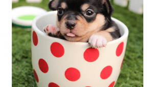
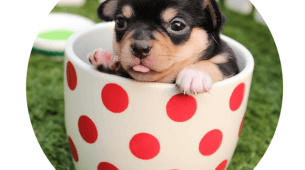
If you really want to break away from the boxed-look, then the border-radius property is for you. With this setting, you can create everything from slightly-rounded corners to full-on circular images with nothing but CSS.
This property can take values in a number of different ways, so it’s best to check out the this tutorial for more information. In our example, the corners are all set to the same value with a single number. The first image shows slightly rounded corners, while the second shows a full-round, or circular, image.
img {
  border-radius: 30px;  // partially rounded corners
}

img {
  border-radius: 100%; // full circular image
}
Things aren’t always what they seem
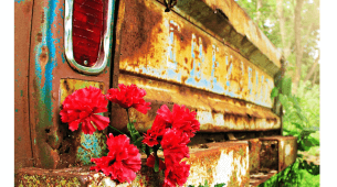
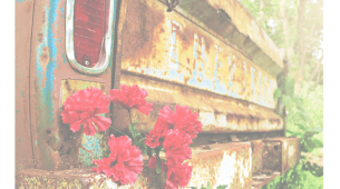
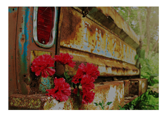
Perhaps you want to show an image but have it “fade” more into the background. In this instance, the opacity setting can be useful. The first is the image as-is; in the second, the image is set at half opacity (0.5). Opacity values range from 0-1, with 1 being “full strength.”
img {
  opacity: 0.5;
}
With a little extra preparation in your code, you can achieve a variety of additional visual tricks. In this example, we’ve set the image as the background to a <div> element instead of a simple <img> tag. Now, a linear-gradient can be applied to the element to create some neat effects.
Here is the base CSS for the source <div>:
.imageDiv {
   background: url(“images/rust.png”);
   height: 700px;
}
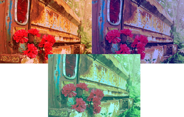
Typically in a linear gradient, two different colors are specified to create a fade effect. But if you use the same color in both places, you can create a photo-filter effect. You could darken the image…
.imageDiv {
  background-image:
	linear-gradient(
  	rgba(0, 0, 0, 0.5),
  	rgba(0, 0, 0, 0.5)
	),
   background: url(“images/rust.png”);
}
…or create a color wash effect.
.imageDiv {
  background-image:
	linear-gradient(
  	rgba(255, 0, 0, 0.5),
  	rgba(255, 0, 0, 0.5)
	),
   background: url(“images/rust.png”);
}
Let CSS do the heavy lifting
Wanting to dig a little deeper? Consider using image sprites. This handy little technique is great for small images or icons (such as social media links or navigation arrows). It combines a single combination image file and CSS for positioning to decrease load times for frequently accessed graphics. With a sprite, the image is loaded once and used multiple places throughout the website. The portion of the image that is seen by the user is controlled with CSS positioning.
There are many tutorials on using image sprites, including this one from Tutorial Republic, if you are interested in trying out the technique. You can also learn more about CSS sprites in this post.
每天推荐一个 GitHub 优质开源项目和一篇精选英文科技或编程文章原文,欢迎关注开源日报。交流QQ群:202790710;微博:https://weibo.com/openingsource;电报群 https://t.me/OpeningSourceOrg
