每天推薦一個 GitHub 優質開源項目和一篇精選英文科技或編程文章原文,歡迎關注開源日報。交流QQ群:202790710;電報群 https://t.me/OpeningSourceOrg
今日推薦開源項目:《安全高效的Rust語言》
推薦理由:Rust 是一個系統編程語言,它注重於三個方面:安全,速度和並發性。因此,它沒有採用垃圾回收機制。它的特點也使得它能在其他編程語言不擅長的場景中大顯身手。它通過一系列不產生運行時開銷的編譯時安全檢查來提升目前語言所關注的領域,同時消除一切數據競爭。Rust還致力於實現「零開銷」,雖然看起來更像是一個高級語言的特性,但我們仍然可以用Rust來實現一些精準的底層控制。
Rust簡介:
![]()
Rust 是一種 預編譯語言(ahead-of-time compiled language),程序編譯好後,把它給任何人,他們都不需要安裝 Rust 就可運行。如果你給他們一個 .rb , .py 或 .js 文件,他們需要先分別安裝 Ruby,Python,JavaScript 實現,不過你只需要一句命令就可以編譯和執行你的程序。這一切都是語言設計的權衡取捨。
Rust使用示例:
例如,在使用一門語言時,編寫一個能夠在屏幕上列印「hello world」的小程序,基本上已經成為了一種傳統,我們以使用Rust來編寫這個程序為例:
fn main() {
    println!("Hello, world!");
}
首先,創建項目文件。值得注意的時Rust並不關心你的代碼存放在哪裡,打開一個終端並輸入如下命令來為這個項目創建一個文件夾:
$ mkdir ~/projects$ cd ~/projects$ mkdir hello_world$ cd hello_world
接下來為Rust創建源文件。Rust的源文件有獨自的標識,以.rs結尾。
同時,Rust程序同樣會有一個main函數。程序中的第一行就意味著:定義一個main函數,沒有參數也沒有返回值。
而println!("Hello, world!");則做了這個程序的所以工作,值得注意的是代碼前的是四個空格而不是製表符。
在編譯運行這樣一個Rust程序時,可以輸入rustc命令來使用 Rust 編譯器並像這樣傳遞你源文件的名字:
$ rustc main.rs
在Linux或OSX系統中在shell下通過如下ls命令你可以看到它:
$ lsmain main.rs
在Windows下:
$ dirmain.exemain.rs
Rust程序幫助編寫工具——Cargo
Cargo 是 Rust 的構建系統和包管理工具,同時 Rustacean 們使用 Cargo 來管理它們的 Rust 項目。Cargo 負責三個工作:構建你的代碼,下載你代碼依賴的庫並編譯這些庫。隨著你編寫更加複雜的 Rust 程序,你會想要添加代碼需要的庫,那麼如果你使用 Cargo 開始的話,這將會變得簡單許多。
Rust的安裝:
在 Unix 類系統如 Linux 和 macOS 上,你只需打開終端並輸入:
$ curl https://sh.rustup.rs -sSf | sh
這樣會下載一個腳本並開始安裝。如果一切順利,你將會看到:
Rust is installed now. Great!
在Windows下:
安裝地址:https://www.rust-lang.org/zh-CN/install.html
Rust的安全性
Rust最大的賣點就在於它的高安全性,儘管在老練的程序員手中保證安全性並不算太難,不過使用Rust可以輕鬆避免一些常見的錯誤。
空指針
如果程序員沒有檢查返回的指針是否為空,就有可能出現這個問題。Rust簡單粗暴的禁用了所有的空指針。
Rust中使用了引用(References)和借貸(Borrowing),引用就相當於原來的指針,借貸相當於一個讀寫鎖。對於一個變數,你只能單方面的讀或者單方面的寫,而不能在改變它的值的同時讀取它。當你改變指針變數產生了空指針時,它就會被禁用,從而防止了空指針的產生。
釋放內存後再使用
Rust使用資源獲取時初始化(Resource Acquisition Is Initialization)的方式讓每個變數在超出範圍後一定被釋放,同時被釋放的內存所有權將會被改變,使得用戶無法訪問
返回懸空指針
在Rust中引用是相當於指針的。而Rust的編譯器會核實返回的引用的有效性,即這些引用總是指向有效的內存。
超出訪問許可權
這個問題通常是數組的索引超出了範圍導致的,比如以下這一段
int a[4]={0,0,0,0};
printf(「%d」,a[4]);
Rust會在運行時進行檢查來減少這種錯誤的行為。
Rust到底值不值得花時間學習?
答案當然是值得,理由如下:
1、擁有開放,友好,高效的開源社區
開放源代碼、GitHub/Git在線開發 https://github.com/rust-lang/rust
開放系統設計過程,重要設計項目的提出、討論、評估、決策均在線進行。
內部決策過程公開透明,每周的發布會議均有記錄
公開接受第三方開發者提交的 Pull Requests,必要時還指導開發
有一個核心團隊(the core team)負責項目的發展方向和最終決策
有大量的(超過 1000 人!)第三方開發者給Rust貢獻源代碼、文檔和測試用例
多次將優秀的第三方開發者吸納進入官方開發團隊和核心團隊
多次在世界各地(包括北京)主辦和協辦小型本地開發者見面會
2、十幾年勤耕不綴
2006年,創始人Graydon Hoare啟動了Rust編程語言項目,用三年完成了第一個可用版本。
2011年,Rust語言編譯器被用Rust語言重寫,完成自舉。
2012年,Servo項目創建,驗證了Rust語言開發大型使用項目的能力。
2015年,發布正式版本1.0。
2018年,1月4日版本更新到1.23.0
3、擁有精心設計的規範透明的開發流程
引入規範化的RFC流程,形成了完整的技術文檔,利於集體討論評估,利於方案實施後期維護。該機制有力地推動了Rust的革新。
4、不拘一格聘請人才
Steve Klabnik 因寫作才華成為核心開發組成員之一。
Tilde公司以前開發的Ruby包管理器Bundler在Ruby領域非常流行,其架構設計被實踐證實獲得成功。14年,Rust官方聘請Tilde公司的核心技術人員Yehuda Katz和Carl Lerche
深受好評的Rust學習示例網站 http://rustbyexample.com 的早期創建者 Jorge Aparicio 後來也被邀請加入 了(Mozilla公司的)Rust官方團隊。
5、大規模的社區參與
社區里,用Rust開發的,或者與Rust相關的開源項目:Servo, Cargo, rust-by-example, Hyper, Piston, rust-postgres, gfx-rs, conrod, rust-sdl2, rust-crypto, docopt.rs, zinc, racer, rust-bindgen, glfw-rs, capnproto-rust, rust-rosetta, graphics, rust-openssl, rust-encoding……
總結:Rust是一個人靠譜,團隊靠譜,技術能力靠譜,態度靠譜,社區靠譜的項目。你值得擁有。
學習鏈接:
Rust Book: https://doc.rust-lang.org/book/
Rust 學習示例:https://rustbyexample.com/
Rust中文教程:http://wiki.jikexueyuan.com/list/rust/
今日推薦英文原文:《The Next 10 Years of Interfaces》 作者:Gabriel Valdivia
原文鏈接:https://uxdesign.cc/immersive-design-the-next-10-years-of-interfaces-16122cb6eae6
The Next 10 Years of Interfaces
Like many designers, I started my career as a Graphic Designer. I dealt in picas, carried Pantone books, and swore to measure twice and cut once. Then the web came along and with it came Web Designers. We had to become acquainted with HTML, CSS, Javascript and we』re still trying to keep up with the right way to build for it.
These websites quickly demanded more interaction from us when Flash entered the scene and conquered our hearts. We turned our attention to animation to convey expressive user flows through interaction design. Then, the iPhone showed up and forced us to think smaller. We got excited about skeuomorphism, learned about pixel density, and made a vow to design mobile first.
After a while, we tried to combine all of the above into a holistic practice that would buy us 「a seat at the table,」 where we could think not just about aesthetics, interactions, and user needs, but also business needs. And so, the modern Product Designer was born.
I』m willing to bet that, like many designers before it, the Product Designer is approaching extinction, and setting the stage for the Immersive Designer.

Virtual Reality (still) matters
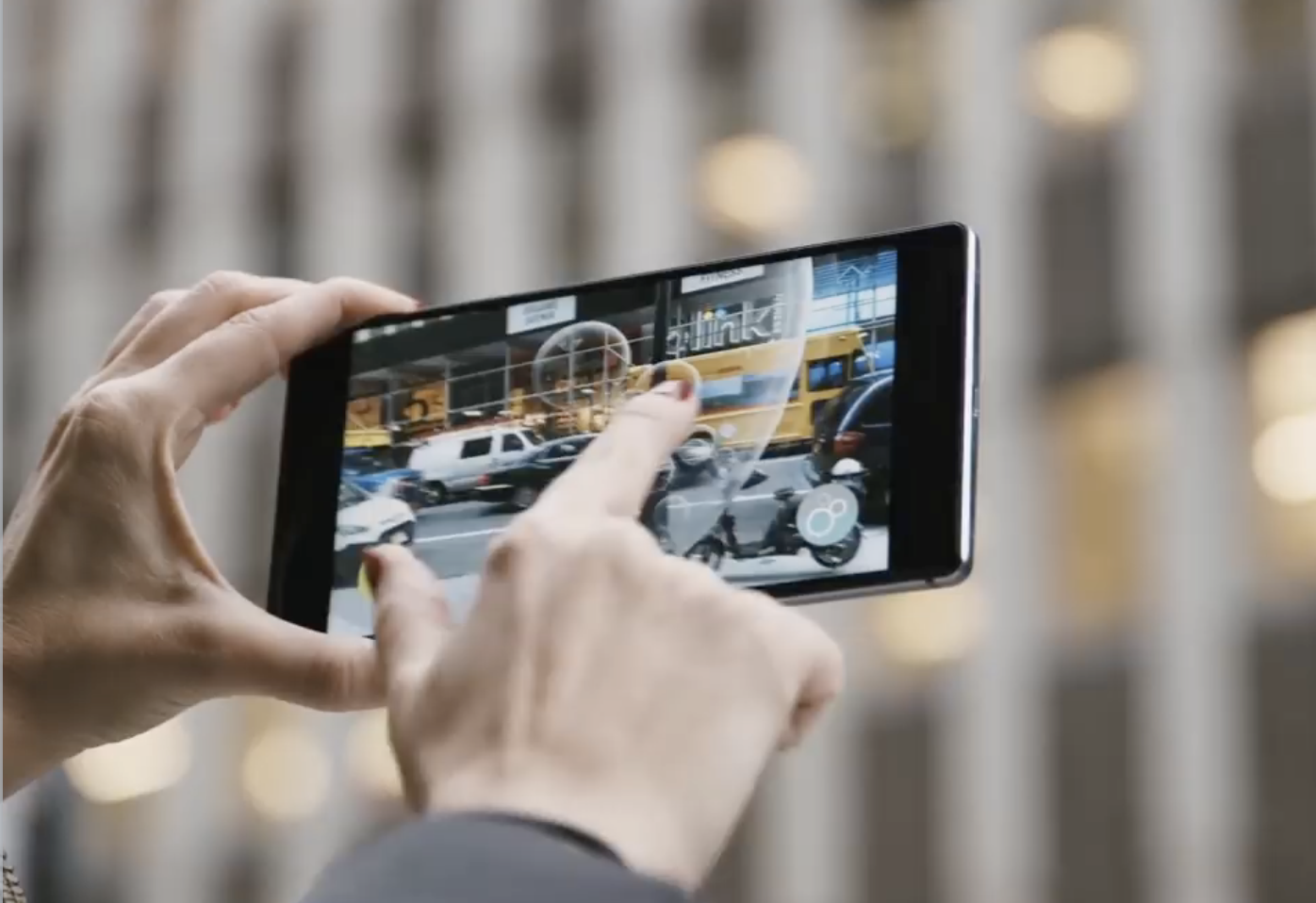
Over the last decade, we』ve seen content move from newsstands, to desks, to our laps, and then into our hands. It seems clear that the next step is to remove the device altogether and place the content in the world itself, eliminating the abstraction between the content and it』s audience. We call the process of designing for this Immersive Design, which includes VR/AR/MR/XR — basically all the Rs.
We are seeing this realized today in phones through Augmented Reality. Tech giants like Apple, Google, and Samsung are rushing to conquer the AR space like a modern Christopher Columbus in search of spices. We』re seeing identity transfer setting a trend in animojis and virtual characters walk around our videos like a Roger Rabbit fever dream. However, designing for mobile Augmented Reality today feels like developing for the Commodore 64 in 1982; investing in a platform that』s novel but filled with practices that will be rendered obsolete before they』re relevant. I』ve found that Augmented Reality in 2018 has two major limitations when it comes to Immersive Design: field of view and input.
Field of view
So far, Augmented Reality is still restricted to a rectangle in your hands. Content can only aspire to be a window into another world; it hasn』t quite inhabited our own yet. Users feel trapped outside in the mundane world while all the fun is happening inside the phone in their hands as if A-ha』s Take on Me never made it to the first chorus.
Input
In 2018, we』ve developed a language for using facial gestures like opening our mouth or raising our eyebrows to control Augmented Reality masks, other experiences rely on the now primitive touch interaction, while the ambitious ones rely on voice commands to interact with the world inside the screen. The input available on the market limits these interactions. However, once we inevitably obviate the phone and achieve immersion through AR glasses, we』ll have to go back to the drawing board and try to answer the billion-dollar question: how do you interact with content in space?
This is where Virtual Reality comes in.
The jury is still out on whether Virtual Reality belongs in your living room or as a museum-like destination that you plan for. We』re still experimenting with the medium to find the adequate cadence for virtual experiences and navigating worlds in the much-adored metaverse. If you think about it, it took film quite a bit of time to arrive at the standard 90-minute duration, which is about as long as it takes your bladder to digest a liter of Coke at the cinema.
Today, Virtual Reality has found a fit as the best way to explore Immersive Design problems present in the Augmented Reality future we crave by taking advantage of a more immersive field of view and using natural gestural interactions. Challenges like thinking in 3D and using volumetric UI that reacts to the environment and the people in it.
Not only can Virtual Reality improve our quality of life by providing great escapism, but it can also open up a bunch of questions around how people could interact with technology if it were all around us. Among other things, I』ve found that Immersive Design invites designers to question the line between content and UI and rethink the process for creating digital products.
Content is changing
As designers we』re often told to get out of the way. To be 「content first」 and make room for the reason people are using your product in the first place. However, Immersive Design poses an interesting question: where does the line between content and UI start and end?
Game designers have been asking themselves this question for decades. As they envision a world to be inhabited by players, the interface to navigate it can often be abstracted into menus that live outside the world』s logic. For example, the interface to start a game often lives in this weird in-between software that acknowledges the existence of the world inside the game by using the game』s characters and aesthetics, but operates based on the rules of the player』s world.
And so, video game companies draw a line between UI and Game Designers. There』s logic to this decision: Game Designers are often proficient in 3D tools while UI designers generally work in 2D. This decision can sometimes lead to immersion-breaking solutions that require players to suspend their disbelief when the game reminds them they』re in a video game with video game systems.
The explicit line between UI and content is tolerable in a video game, but as we step into the world of Immersive Design, we won』t necessarily have the luxury of flat menu trees that exist outside our reality. We are tasked with finding solutions for UI that follows the rules of our augmented world; where do the menus come from and how do we interact with them?
As they』ve matured, video games have given us examples of how design can be woven into the environment and blur the line between content and interface.
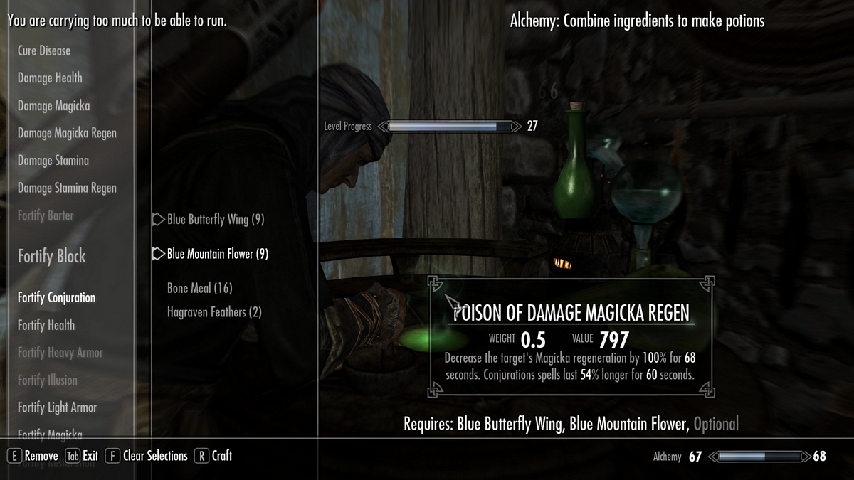
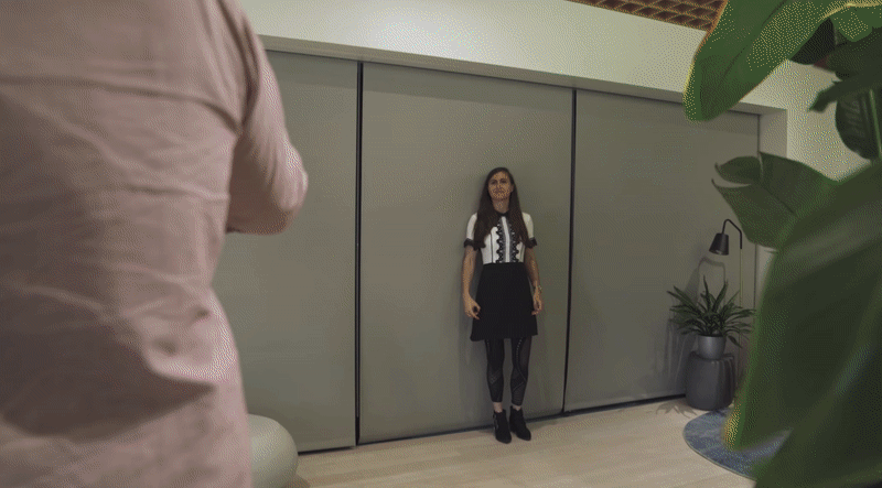
On the left image above, 2011's Skyrim shows UI to manage inventory plagued with floating text alerts around the screen, using the typeface Futura for a game that takes place in medieval times. Although the menu is intuitive and efficient, it grossly breaks immersion and reminds the player that dragons aren』t real. On the right, 2018's S.O.S. relies on a more immersive schema that pulls out a physical map in the player』s point of view and requires the use of a radio (with radio channels and static) to communicate with other players.
We are seeing similar practices arise in Virtual Reality games. Although some games rely on the traditional 2D menu systems, others place cues in the environment to educate the user. This is important because, in VR, the player has fewer abstractions to escape to. VR controllers are often shaped around a player』s hand to promote natural interactions that don』t typically lend themselves to menu trees.
On the left, Doom VFR uses a traditional approach to user interface — a 2D panel of information floating in space. On the right, Winston』s Heart places the UI in the world as a clipboard that can be grabbed and reacts to the lighting in the environment. Doom doesn』t seem concerned with reminding users that they』re in a video game, which of course needs to provide you with text cues for learning how to play the game. However, Winston』s Heart makes an effort to insert those cues as a plausible element in the environment, further enhancing the immersion of that experience.
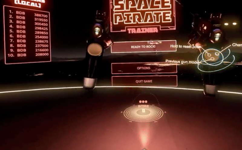
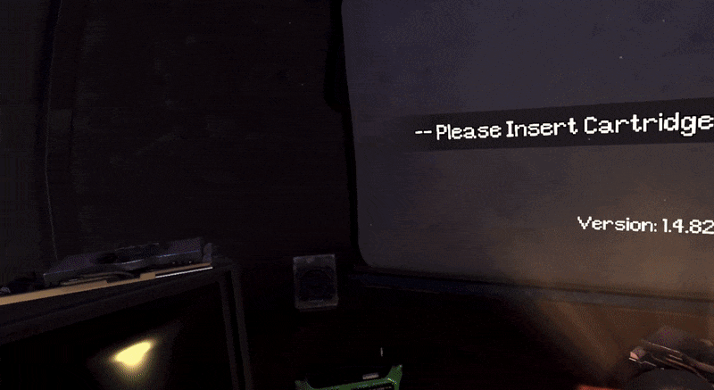
On the left, Space Pirate Trainer asks the user to literally shoot menu items to select the game mode. On the right, Arizona Sunshine lets the user grab and insert cartridges into a retro console to pick a game mode. The point-and-shoot interaction is carried over from the mouse and keyboard era and ported into the context of the Space Pirate Trainer while using cartridges to select a game mode fits perfectly within the tone of Arizona Sunshine and evokes a feeling of nostalgia that many VR players crave.
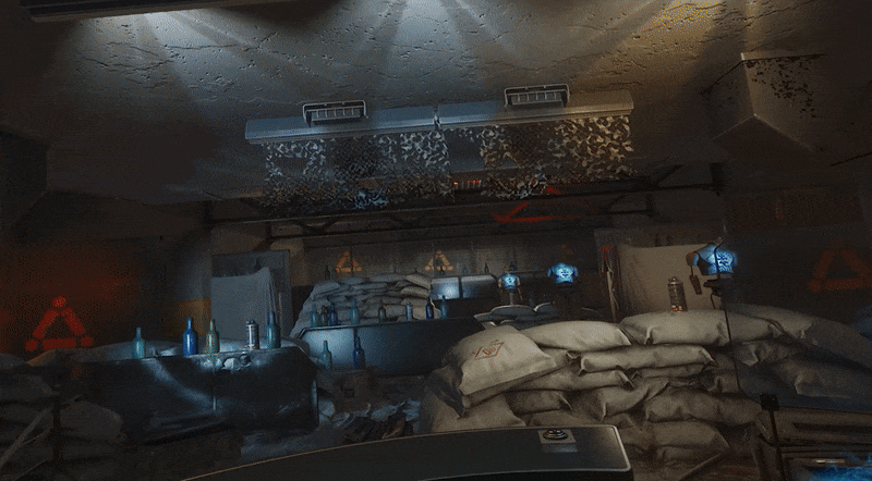
Arktika 1 applies a clever, mind-bending technique to enter a tutorial: the user is handed a VR headset inside the VR experience. By putting the headset on, the user agrees to suspend their disbelief and enter a virtual world that doesn』t follow the same rules as the Arktika world. It』s a tongue in cheek moment that ambitiously aspires to create not one but two alternate worlds. By contrast, the Arktika world feels much more real because it appears self-aware and higher fidelity than the training environment.
These are a few examples of the great Immersive Design work happening in Virtual Reality right now. For many of us, stepping into Immersive Design means placing a bet that content won』t be confounded to the boundaries of a screen. We see that as an opportunity to invent interactions that are so intuitive they become invisible — like pinch to zoom or pull to refresh. Today, our work consists in finding those interaction patterns, which will seem obvious in retrospect.
每天推薦一個 GitHub 優質開源項目和一篇精選英文科技或編程文章原文,歡迎關注開源日報。交流QQ群:202790710;電報群 https://t.me/OpeningSourceOrg