今日推薦開源項目:《家庭助理 home-assistant》
今日推薦英文原文:《Oh Wait, Let Me Take a Screenshot of That》

今日推薦開源項目:《家庭助理 home-assistant》傳送門:GitHub鏈接
推薦理由:Home-assistant 是一款開源的家庭智能助手,將本地控制和用戶隱私放在首位。該項目由世界各地的愛好者提供支持,非常適合在本地伺服器上運行。
今日推薦英文原文:《Oh Wait, Let Me Take a Screenshot of That》 作者:Lasse Kallesøe
原文鏈接:https://medium.com/better-programming/oh-wait-let-me-screenshot-that-d2b5deaf4502
推薦理由:本文是一項關於如何改進ios的調查,關於人們頻繁使用的屏幕截圖和快照,為了不讓我們當時留下的的截屏最後躺在相冊里吃灰。
Oh Wait, Let Me Take a Screenshot of That
A UX designer』s investigation into how we remind ourselves — and how we might improve iOS

(Photo by Dayne Topkin on Unsplash)
Context
Have you ever tried capturing a screenshot or a photo of something you wanted to be reminded of in the future? Capturing screenshots or photos as self-addressed reminders is a habit most people are familiar with.Almost everyone has tried capturing a screenshot or a photo to remind themselves of a book to buy, an inspirational quote, travel plans, something to be shared with a friend, or something else we want to act on at a later point in time.
This event-based reminder has no exact time of when we want to act. We just know that this is interesting and that we want to act on it at a later point in time.
To define the scope, we asked ourselves the questions:
- 「How are photos and screenshots that serve as self-addressed reminders captured and organized?」
- 「Are the reminders acted upon, and in that case, how long does it take before acting?」
Methodology
In this mini-research project, we have so far only focused on the research part and to come up with design suggestions on how Apple might improve their user experience on iOS, based on the findings from investigating this phenomenon.The design suggestions have therefore not been tested with any users yet. Therefore, part of the reason for posting this article is also to get the ideas out there and test assumptions with users.
Because the phenomenon is definitely happening, so there is a huge chance that you might be a user. Therefore, a response would be highly appreciated for further investigation.
The suggestions in this article only come from asking ourselves the question: 「How might we improve the user experience on iOS, based on the findings from our research?」
We used contextual inquiry to interview 14 participants who all were asked to go through the last ten pictures they captured and answer some questions about each picture.
The study contains answers from around 120 pictures, which all serve as self-addressed reminders. In the interviews, we asked the participants questions about what they were storing, where they were, if they organized the pictures in any specific way and if they acted on the reminder.
To figure out what the participants were storing, thematic analysis was used to firstly code all the pictures into themes and secondly, code the themes into concepts, to draw the meaning of what it is people are storing.
The next was to answer our research question where we visualized the answers from our participants to get a better overview of the results.
Results
It was significant that this phenomenon is going on right now. All participants were storing screenshots and photos as self-addressed reminders, but the objectives of the pictures were different.The most significant concepts stored were inspiration, share, and purchase.

(This model shows the count of different concepts that were stored as self-addressed reminders)There were some similarities between the participants. Participant 1 and 7 were the most similar as they both mostly stored pictures of things to purchase and inspirational stuff such as quotes and memes.

(This model shows the count of different concepts the participants were storing as self-addressed reminders)Another question answered was where they were when they were storing the different concepts. Around 50% of the concepts were stored at home, which shows that this is something that is done both at home or when the participants were on the move.

(This model shows where the participants were when the reminder was captured.)The last question we got answered was if the participants acted on the reminder. 57 out of 110 did not act and 53 out of 110 did act. This shows that more than half of the reminders that were being captured were not being acted upon.

(This model shows how long time it took the participants to act on their reminders)
Defining the Design Challenge
The results were showing that the participants did not act on most of their reminders and that they were likely to be on the move or busy with something else while capturing the reminder.So, we came up with the problem definition:
How might iOS facilitate the user in the capture and re-finding phase to increase the percentage of reminders being acted upon?
Design suggestions — How might we (HMW)?
To visualize the challenge, we created a simple hypothetic user journey.
(Simple hypothetic user journey created on journeytool.io)Afterwards, we split the challenge into more manageable chunks and came up with some HMW questions for each touchpoint of our hypothetic user journey.
The first HMW question was: 「How might we improve the capture phase when capturing a photo through the camera app so iOS opens edit mode, like when capturing a screenshot?」
On the screenshot side, iOS already knows that it is a screenshot that is being captured, so it is categorized and the edit mode opens after capturing.
On the camera side, we came to a possible solution being a 「reminder」 mode that the user can switch to in the camera app. See the design suggestion below.

(Suggestion: Capture (Left: Screenshot, Right: Photo))The next HMW question we asked was: 「How might the user be able to set a reminder when entering edit mode?」
The possible solution we came to was to implement a reminder button in edit mode, so the user is able to set a reminder. See the design suggestion below.

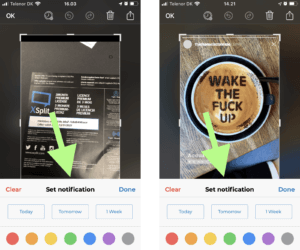
(Suggestion: Set reminder (Left: Screenshot, Right: Photo)) The next HMW we asked was: 「How might the user quickly set a notification and categorize a reminder to make it easier to re-find a screenshot or photo at a later point in time?」
Here, a possible solution could be to show a pop-up that allows the user to organize the reminder with color and three simple choices of when to receive a reminder notification. See the design suggestion below.

(Suggestion: Set notification and organize (Left: Screenshot, Right: Photo))The next HMW question asked was: 「How might the user be able to re-find a reminder at a later point in time?」
The possible solution we came up with was to make another folder in the album where the user is able to sort reminders by colour. See design suggestion below.

(Suggestion: Re-finding reminders (Left: Album overview, Right: Reminders album))
Acknowledgement
A huge thanks to Aalborg University Copenhagen and Toine Bogers for supervision on this project. Also credits for collaboration on the project to Victor Graffmann.Future Work
If you have any ideas, thoughts, suggestions, etc., it would be highly appreciated if you write a response to the article below. This will help us in further investigation. Thanks!下載開源日報APP:https://openingsource.org/2579/
加入我們:https://openingsource.org/about/join/
關注我們:https://openingsource.org/about/love/
