今日推薦開源項目:《提示氣泡 balloon.css》
今日推薦英文原文:《Foldable Devices: Should We Care?》

今日推薦開源項目:《提示氣泡 balloon.css》傳送門:GitHub鏈接
推薦理由:在頁面上採用滑鼠懸浮後顯示提示欄來節省頁面空間並引導用戶使用的方法早已屢見不鮮,這個項目正是一個採用純 CSS 實現的滑鼠懸浮窗口,只需要在 HTML 標籤中寫入文本並選擇相應的設置,或者是通過 CSS 自定義需要的樣式,就可以在元素懸浮時彈出懸浮窗口而不需要 JS 的介入,不失為一個使用滑鼠懸浮提示時的選擇。

今日推薦英文原文:《Foldable Devices: Should We Care?》作者:Omar Rabbolini
原文鏈接:https://medium.com/swlh/foldable-devices-should-we-care-a847f37126f8
推薦理由:介紹可摺疊設備對軟體方面的影響
Foldable Devices: Should We Care?
Analyzing the foldable smartphone trend from a software maker』s perspective
Foldable devices are all over the news these days. Some are based on actual foldable displays (Samsung, Huawei), others are more economic and use two separate panels rotating around a 360⁰ hinge (LG, Motorola, Microsoft).Regardless of the underlying implementation, the purported use cases are similar:
- Run two apps side-by-side
- Let an app use extra screen real estate when available
Are foldables the future, or just a passing fad?This is an important question to consider, as we need to decide whether to invest any resource on the investigation of this form factor and its effect on our products.
In order to answer it, we need to digress a bit and see how we got to the current state of affairs in mobile development.

Photo by Stanislav Kondratiev on Unsplash
Getting here
The physical design of mobile devices hasn』t changed much for the past 10 years. Mostly all manufacturers have settled on the form factor introduced by Apple with the iPhone in 2007 (and the iPad in 2010 on the tablet side) with little variation on the theme. Granted, there has been a certain degree of differentiation in details such as the placement of cameras and biometric sensors, and of course the deliberate selection of materials and components to justify different price points, but in the end all modern mobile devices look pretty much the same: a rectangular slate largely dominated by a touchscreen, running either of the two dominating OSs (iOS and Android).In terms of software, ecosystem-specifics aside, there isn』t really much difference for the end user to choose one platform over the other. Most apps (and games) are available on both, with pretty much the same functionality. The operating systems themselves have been converging in user experience too, with the once unique benefits of widgets (Android) and coherent notification handling (iOS) now working in a similar way on both platforms.
The effect of this convergence for us software makers has been that we have no choice but to write software for both OSs if we want to stand a chance to see our app being widely used.
Luckily, the uniformity in the space has made this easier. Nowadays there are frameworks such as React Native and Flutter which allow us to write cross-platform code in record time while maintaining good performance and a native user experience across both systems.

Photo by Jens Johnsson on Unsplash
Living in a uniform market
Uniformity and conformity are nice, but they stifle innovation. In a market where everybody is the same, there are only three possible outcomes when you』re trying to be different:Outcome A : Nobody cares
Outcome B : You carve out a niche
Outcome C : Your solution is so much better than everybody else that it disrupts the market
These are in order of likelihood, from most likely to least likely. Most challenges to the status quo end up in the Outcome A bucket.
Products that solve a real problem are more likely to end up in either Outcome B or Outcome C, depending on the size of the problem (i.e. how many users are affected) and the fitness-for-purpose of the solution.
Let』s look at some examples of products falling into these different outcomes:
Outcome A : The Blackberry Playbook, a tablet that tried to challenge the iPad and nascent Android tablet market by riding on the Blackberry platform』s coattails but was ultimately let down by app unavailability (even after introducing Android apps support.)
Outcome B : The Samsung Galaxy Note, a smartphone now in its 10th iteration with a killer feature in its S-Pen. Not everyone』s device of choice, but the only one you need if you are traditionally a fan of jotting down handwritten notes.
Outcome C : The Apple iPhone itself. We had smartphones before the iPhone came along, but they were a completely different beast. The iPhone threw away the physical keyboard in favor of a variable screen real estate that enables better content consumption on the go without much drawback when user input is needed.
The question for the foldable is then the same age-old one:
What is the problem you are trying to solve?At the beginning of this article, we saw the two common use cases we are presented when looking at foldables. These are valid, and more use cases might transpire as the foldables make their way to consumers. However, they are use cases for the device itself, not necessarily for a third-party app.
As software makers, we need to understand what』s the benefit of using two screens for our own app, and how to behave accordingly.
I am specifically considering the foldable as two screens joined together in this case, as it』s easier to illustrate my point, but the same applies when looking at the screen as a resizable work area which expands and shrinks according to the user』s preference.
Let』s consider the case of an e-Book reader. Assuming a device is foldable along its Y-Axis (i.e. like a real book), the easy answer is to present two pages side-by-side to the user when the device is open. This is nice and skeuomorphic, but does it really buy much to the user aside for a less frequent page flip?
Depending on the specialization of the app, there are more interesting alternatives. For instance, if our e-Book reader was targeted at students or researchers, we could use the extra screen real estate to allow our user to annotate and read footnotes. For language learning, we could have content in two different languages side-by-side.
Another example is that of an agenda / organizer app like Microsoft Outlook. You could use one side of the fold to display your daily overview, while the other side would show details of your next appointment and a map of its location.
These are UX consideration based on the availability of both screens for our app. There』s also the use case of our app being on one side while another app is presented on the other, at the user』s choice. In this case, our app could behave differently depending on the context, e.g. by making it easier to send and receive information to / from another app while in this mode.
This brings me to the next point:
How good is the API?This is a question mainly directed at the device manufacturers and OS developers. We can only support foldables if good APIs are provided.
On iOS, we often saw Apple keeping their APIs private in the past, especially when introducing new technology. This does not help with adoption as it limits the use case investigation we talked about earlier.
On Android, there』s a risk that different manufacturers come up with different APIs for their own implementation of a foldable device. We have seen this before with Samsung and their S-Pen SDK and multi-window support. This was resolved in Android 6 and 7 respectively, with the OS catching up and offering more support for exotic (for lack of a better word) devices.
As Apple hasn』t entered the foldable race yet, we don』t know what』s in store on that front. On the Android side, Samsung is seemingly relying on existing Android support for the concurrent display of multiple apps (good), while LG relies on their own Dual Screen SDK (bad). This is less than ideal.
So, should you investigate foldables support for your app?

Photo by Mika Baumeister on Unsplash
Foldables and you
Thanks for sticking around thus far. Hopefully you have a better idea now of whether it』s worth investing any time on foldables at this point, but here are the main considerations once again:What benefit does a foldable bring to your user?
Depending on your app, the user』s benefit in using a foldable may vary. Generally, anybody can benefit from more screen real estate, but specific apps might use this extra space to boost productivity or provide a different user experience.If you think your app falls in the latter camp, then it might be worth spending some time to do further research.
Can you get by with the current API?
The APIs will evolve alongside the foldables. More functionality might be coming later as the use cases become clearer and uniformity once again is applied to this new technology. Can you wait until then, or is there any benefit in jumping on the foldable bandwagon sooner?Will there by widespread user adoption?
This is another important point to take into account. Foldables are an example of manufacturers trying to be different. Looking at the three outcomes we saw earlier in this article for such cases, chances of success in this differentiation are dependent on the solution solving a real problem for the user.At the moment, foldables seem more like an answer in search of a question. They don』t justify the added bulk and price with a convincing argument and therefore seem more like a passing fad. However, it』s still early days. Apple hasn』t made a move in the space yet, while Microsoft showed a couple of interesting takes on the concept slated for release towards the end of 2020 (Surface Duo and Neo).
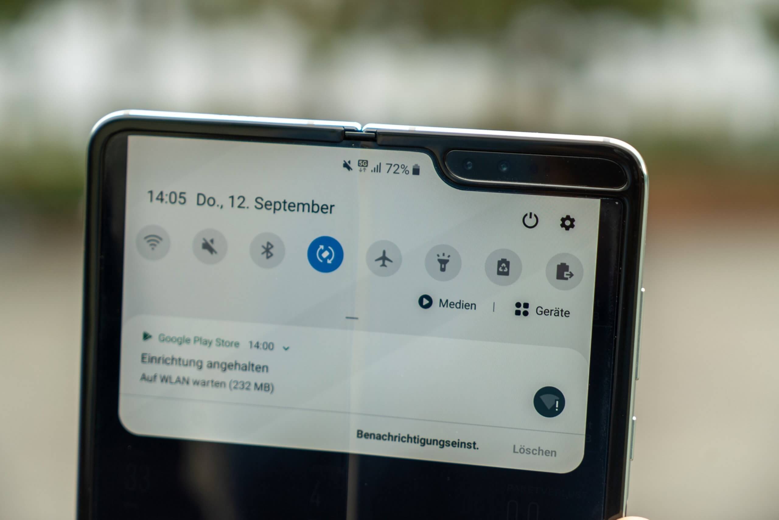
In conclusion, I wouldn』t discard the trend as a fad yet, but I want to see more. I want to see the Galaxy Fold in the wild, I want to play with the LG G8X and its dual screen. I want to see how Microsoft and Google are collaborating on the Surface Neo to supercharge productivity.
On the user experience side, I want to see experiments with this form factor involving the average consumer. Do they find it confusing? How would they use the extra screen? What』s the main mode they』d use the device in (folded, open, in portrait mode, in landscape, etc.)?
All in all, this trend is a breath of fresh air after years of me-too slate designs, but it』s still in its infancy. Business viability and market adoption will most likely be determined by the evolution of this form factor in the next year or so, alongside the consolidation of APIs and SDKs to enable third party development.
下載開源日報APP:https://openingsource.org/2579/
加入我們:https://openingsource.org/about/join/
關注我們:https://openingsource.org/about/love/
