今日推薦開源項目:《變個截圖 html2canvas》
今日推薦英文原文:《I A/B Tested Resume Formats: Which Jon Snow Gets Hired?》
今日推薦開源項目:《變個截圖 html2canvas》傳送門:GitHub鏈接
推薦理由:截圖發聊天軟體早就成了日常的一部分,這個項目可以讓你幫助其他人對你的網頁進行截圖——不過需要對你的網頁做一些限制。它的截圖原理是讀取 DOM 來確認應該顯示什麼,所以可能與真實情況有所偏差,而且有些 CSS 屬性並不在它的支持範圍內,其他還有不適合與 Node.js 一同食用等等的你需要在編寫頁面時注意的限制……不過如果你的頁面的確需要也很適合帶上一個快速截圖的功能,那麼這個項目依然值得考慮。
今日推薦英文原文:《I A/B Tested Resume Formats: Which Jon Snow Gets Hired?》作者:Ryan Perry
原文鏈接:https://medium.com/better-programming/i-a-b-tested-resume-formats-which-jon-snow-gets-hired-cd206f62d15a
推薦理由:兩種不同的簡歷風格對比——不過在我個人看來:在表達清楚的前提下做的美觀一點似乎更好
I A/B Tested Resume Formats: Which Jon Snow Gets Hired?
Does colorful and graphic beat plain and professional?
For most, writing a resume is one of the most boring activities on the planet. When I recently re-wrote mine, I couldn』t tell whether I was more dissatisfied with the tedious process or with the bland final result (or both?). As a former software engineer, making a resume in the standard professional format felt like building a website』s landing page with no CSS styling.
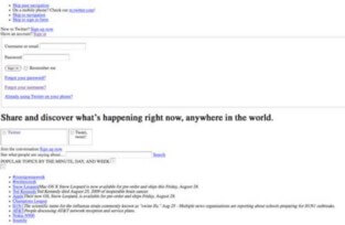
For example, let』s use Twitter』s landing page, which is designed to quickly give users direct snippets of information, in a similar way to how resumes are designed. Imagine how much less engaging Twitter would be if it looked like this:
It』s no surprise that with the traditionally formatted resume, recruiters only spend eight seconds on your resume; it』s just a bland representation of your professional journey (which they』ve likely seen before).
Defying Conventional Wisdom
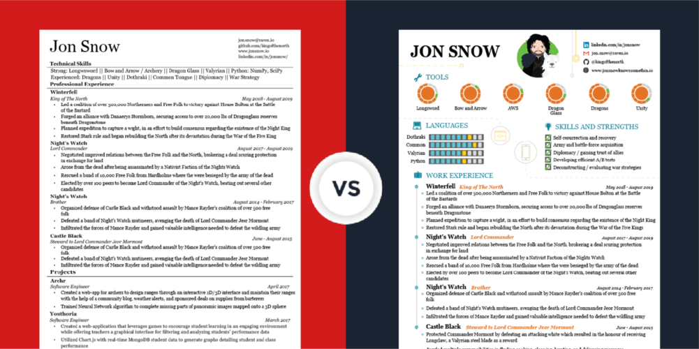
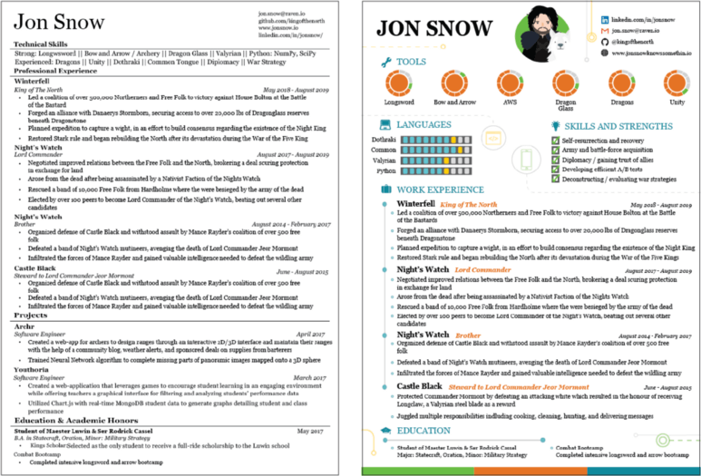
I understand the conventional wisdom that you should try to maximize the amount of information a recruiter can learn about you in that short amount of time. However, just like the unstyled version of Twitter, I think the traditional professional resume is objectively less interesting to look at. The graphic stylized version, however, draws in the viewer using various UI/UX techniques.After I finished updating my professional resume, I decided to try building a graphic version (with the same content). Here are the two versions that I came up with. Since this piece is meant to focus on the format of the resumes and not the content, I swapped out the original content for fictional content.
To build the graphic resume, I started with a blank page in Adobe Illustrator (as opposed to the same Microsoft Word template I』ve been using the past seven years) and treated the process as if I were designing a game or website.
When I finished, I was much happier with how the graphic-formatted resume turned out than the professional one did. The colorful graphic style was a more authentic representation of me, both as a person and a professional.
Additionally, a traditional resume can only directly declare or describe clichéd traits like 「creativity」 or 「thinking outside the box,」 but the graphic resume can exhibit these traits in a way that the professional one is too constrained by its arbitrary rules to do.
How Do the Two Formats Perform?
Next, I set up an experiment to see how the two resumes stack up against each other in terms of how they』re received in the professional world. I built a website and landing page to host the two resumes. Using the product analytics software Heap, with one line of code I was able to record which resume users clicked first and also to collect data on time spent per resume.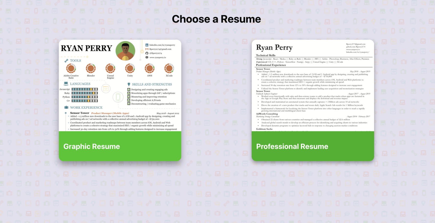
Note: In order to remove positional bias, 50% of the time 「Graphic Resume」 showed up on the left and 50% of the time 「Professional Resume」 showed up on the left.
I added Heaps tracker to my page, and I received enough traffic to produce statistically significant results on how users behaved. These are the results from the experiment:

Which Format Was Better?
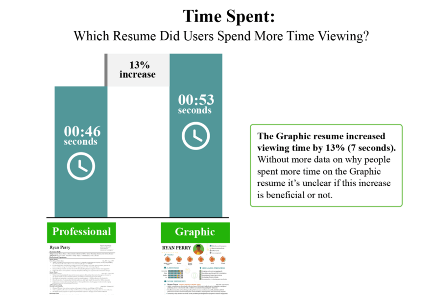
With over 1,500 sessions used as data points for this experiment, it』s enough data to draw a few quantitative conclusions. If the goal is to get people to spend more time looking at a resume, then the probabilities suggest using the graphic resume would be most successful. Not only do people spend 13% more time viewing this resume, but 11% more people chose the graphic resume over the professional one.However, without adding qualitative data from the stories of people who visited the website, it』s not fair to extrapolate from these two statistics that there』s also a higher probability of getting an interview.
For example, if I did the same experiment to determine whether with an image of me from last Halloween or a professional headshot should be my LinkedIn profile picture, people might look at my Fresh Prince costume 11% more and for 13% longer, but that doesn』t (necessarily) mean that it should be my LinkedIn profile picture.
Qualitative Data Has Been Mixed So Far
For what it』s worth, I』ve also spoken directly with six friends/colleagues (three recruiters, one engineering manager, and two product managers). When I asked which resume they preferred, the three recruiters unanimously chose the professional resume.However, the other three people I spoke with, none of whom are recruiters, but all of whom are involved in recruiting processes, claimed that they would prefer to see the graphic resume.
Which Jon Snow Gets Hired?
For now the final verdict is TBD. I『m currently gathering more stories from people about which resume they』d prefer and why so that I can make a more sound conclusion.If you have someone in your network who has experience reviewing resumes and might be willing to offer feedback on which one they』d prefer, then please share this post with them. Additionally, if you have any feedback yourself, then leave a comment explaining which format you』d prefer!

下載開源日報APP:https://openingsource.org/2579/
加入我們:https://openingsource.org/about/join/
關注我們:https://openingsource.org/about/love/