今日推薦開源項目:《反面教材 WorstVolumeControls》
今日推薦英文原文:《The worst volume control UI in the world》
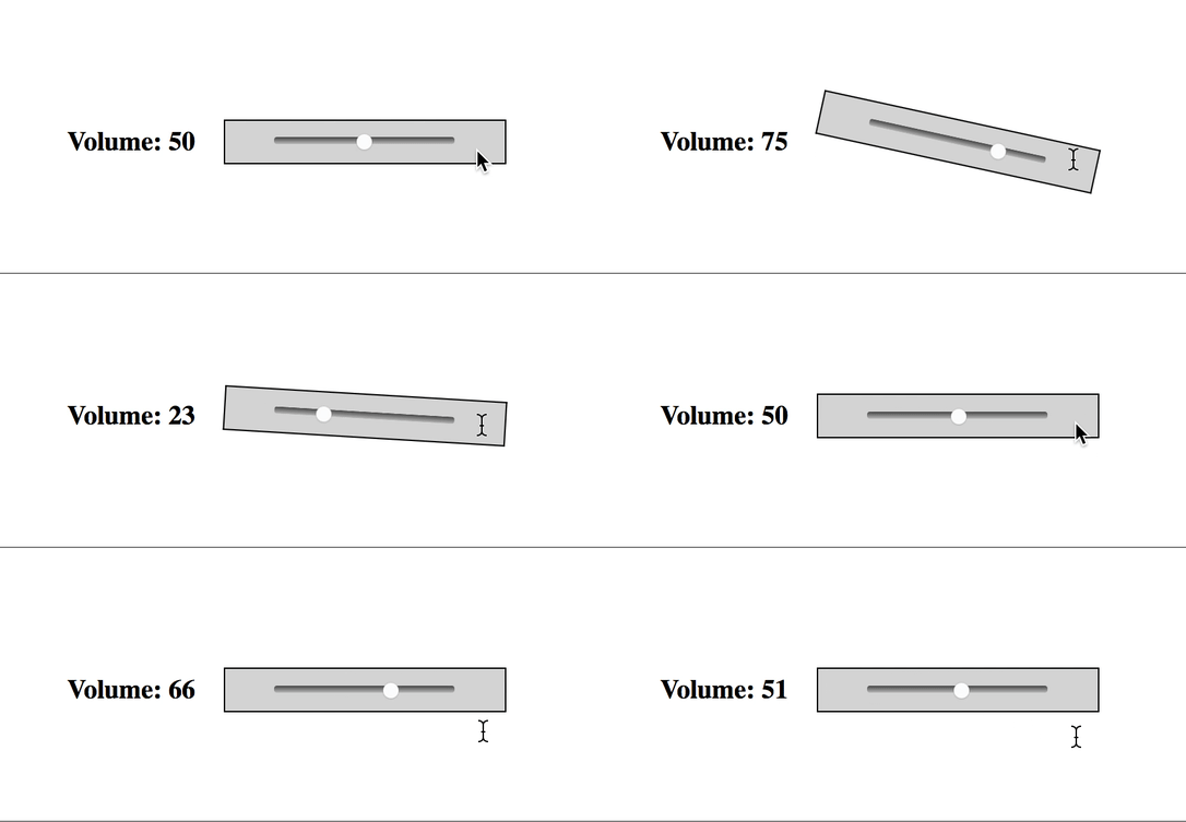
今日推薦開源項目:《反面教材 WorstVolumeControls》傳送門:GitHub鏈接
推薦理由:如何用最差的方法設計音量控制器(其一),雖然這個方法實際上還算是相對比較人性化的那種,如果想看更加非人哉的例子,請參考今天的英語文章推薦。如果斗膽嘗試此項目,請務必在非外放模式下,不播放任何音頻時進行,不然就可能會體驗到包括但不限於耳膜爆破,奧術魔炮,死亡咆哮等等的感受,請勿輕易嘗試。
今日推薦英文原文:《The worst volume control UI in the world》作者:Fabricio Teixeira
原文鏈接:https://uxdesign.cc/the-worst-volume-control-ui-in-the-world-60713dc86950
推薦理由:設計令人腦殼疼的音量控制 UI
The worst volume control UI in the world
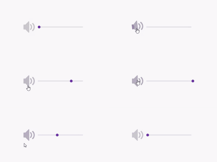
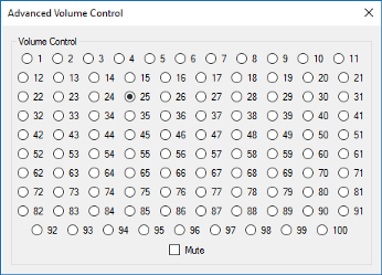
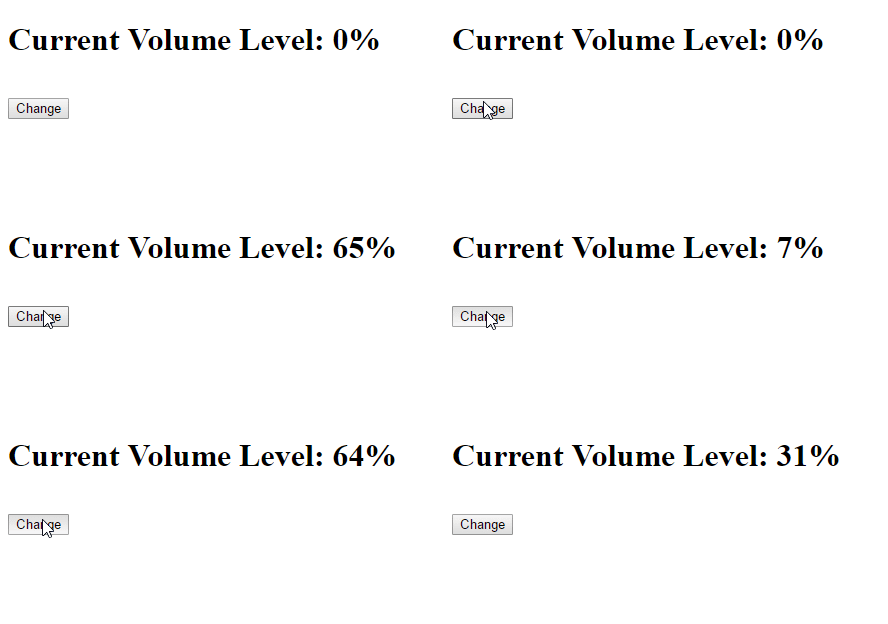
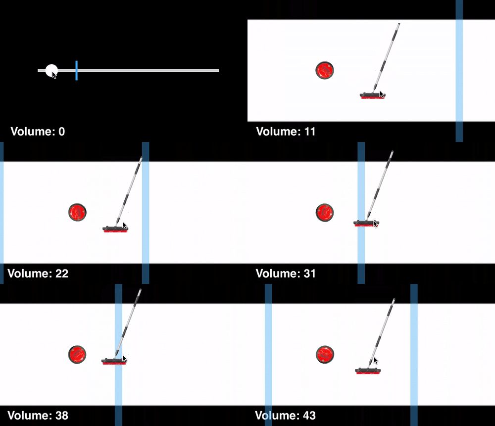
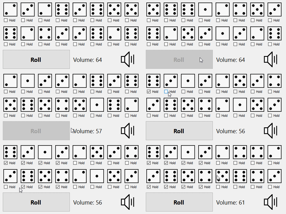
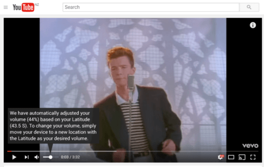
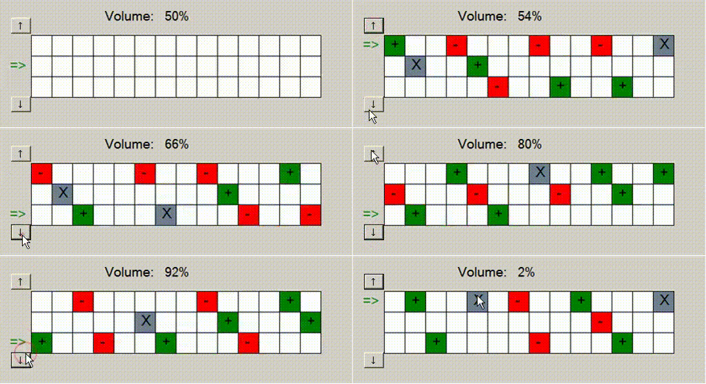
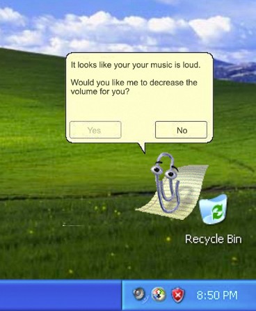
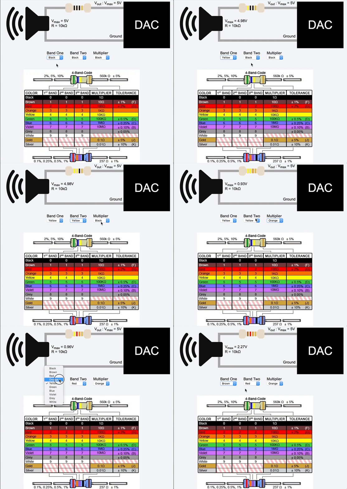
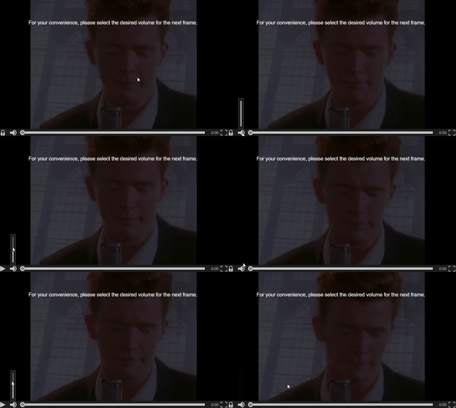
A group of bored developers and designers has decided to start a thread on reddit to figure out who can came up with the worst volume control interface in the world:Yep. That super simple volume control UI we interact with several times a day. How can we make it extremely complicated?
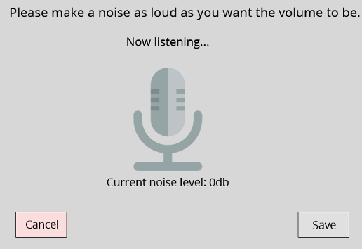
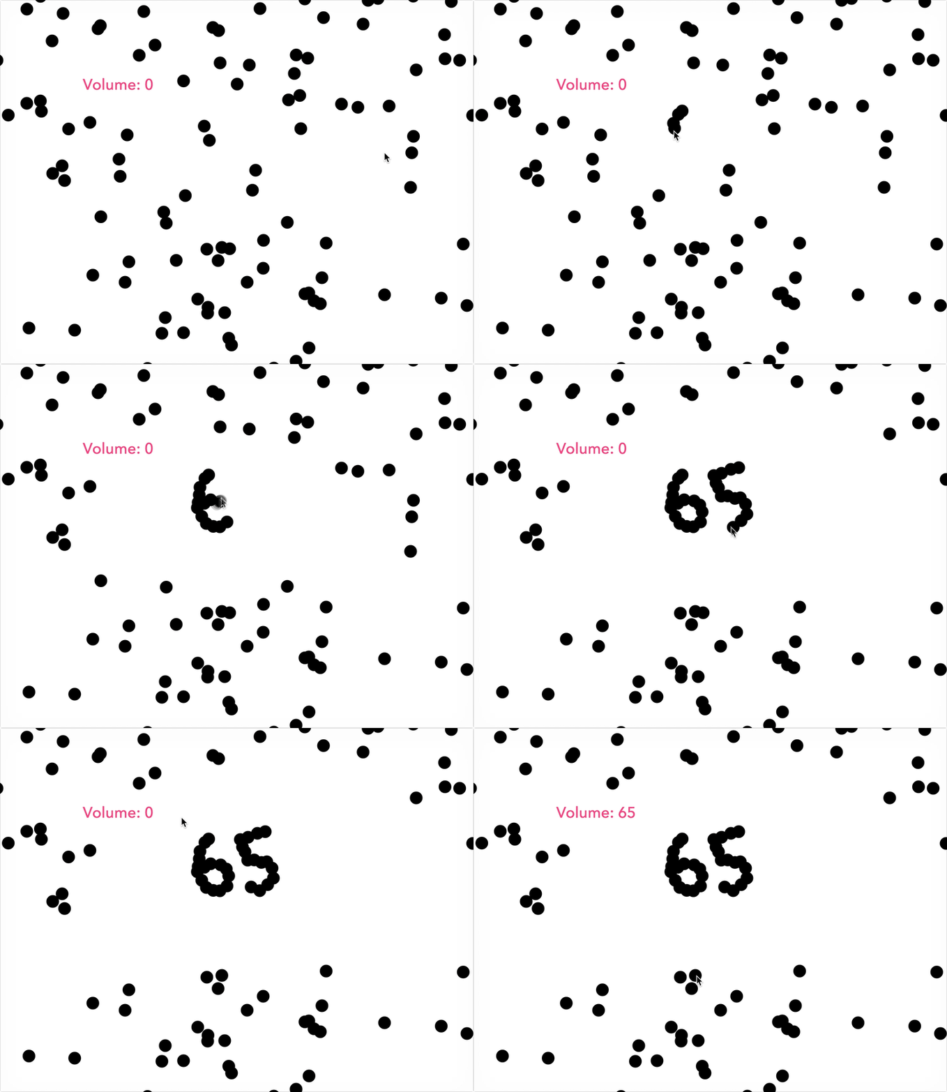
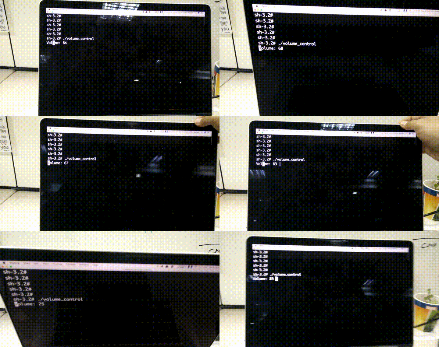
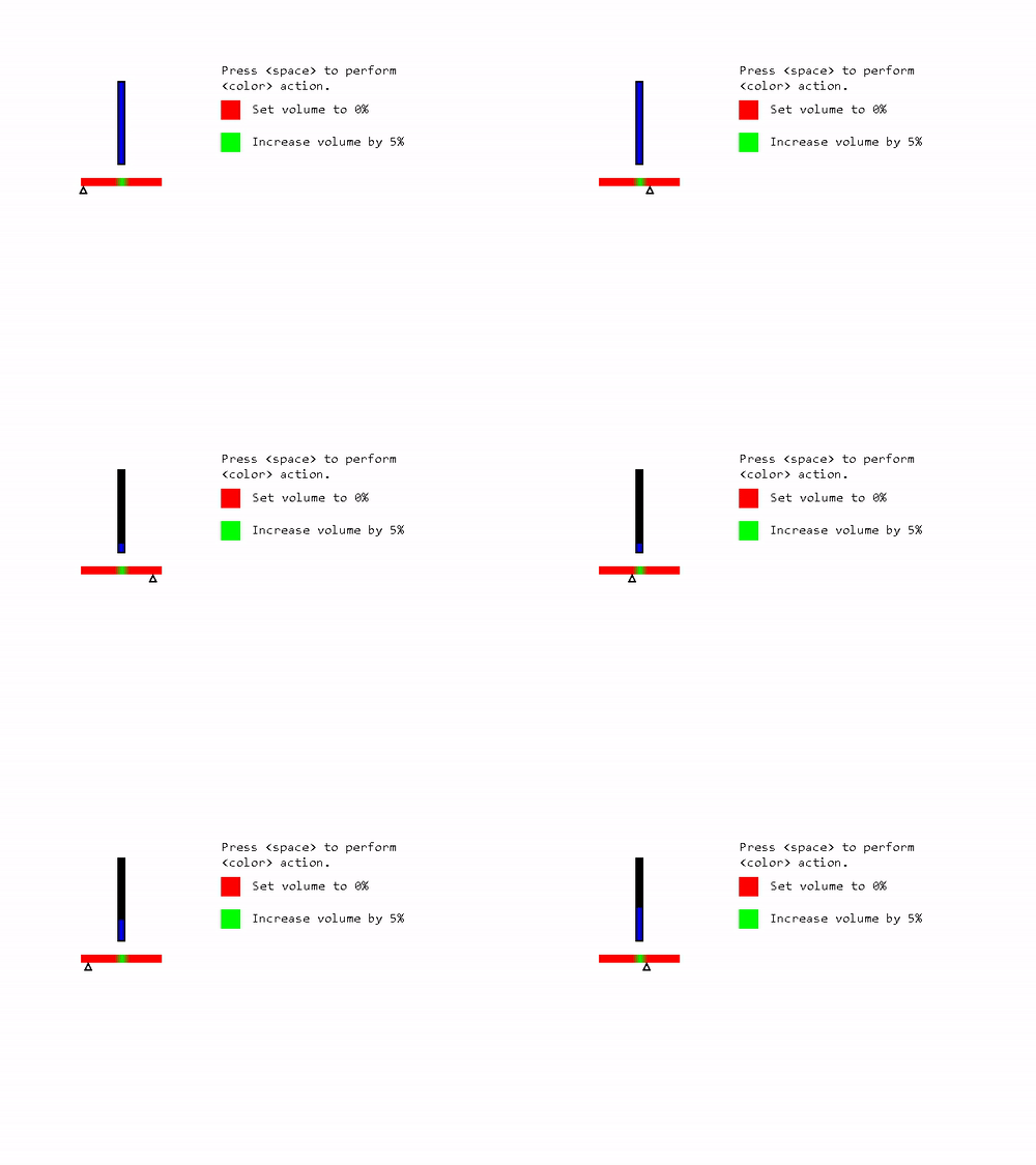
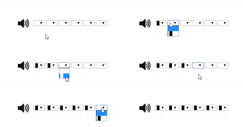
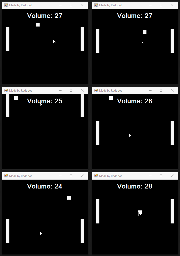


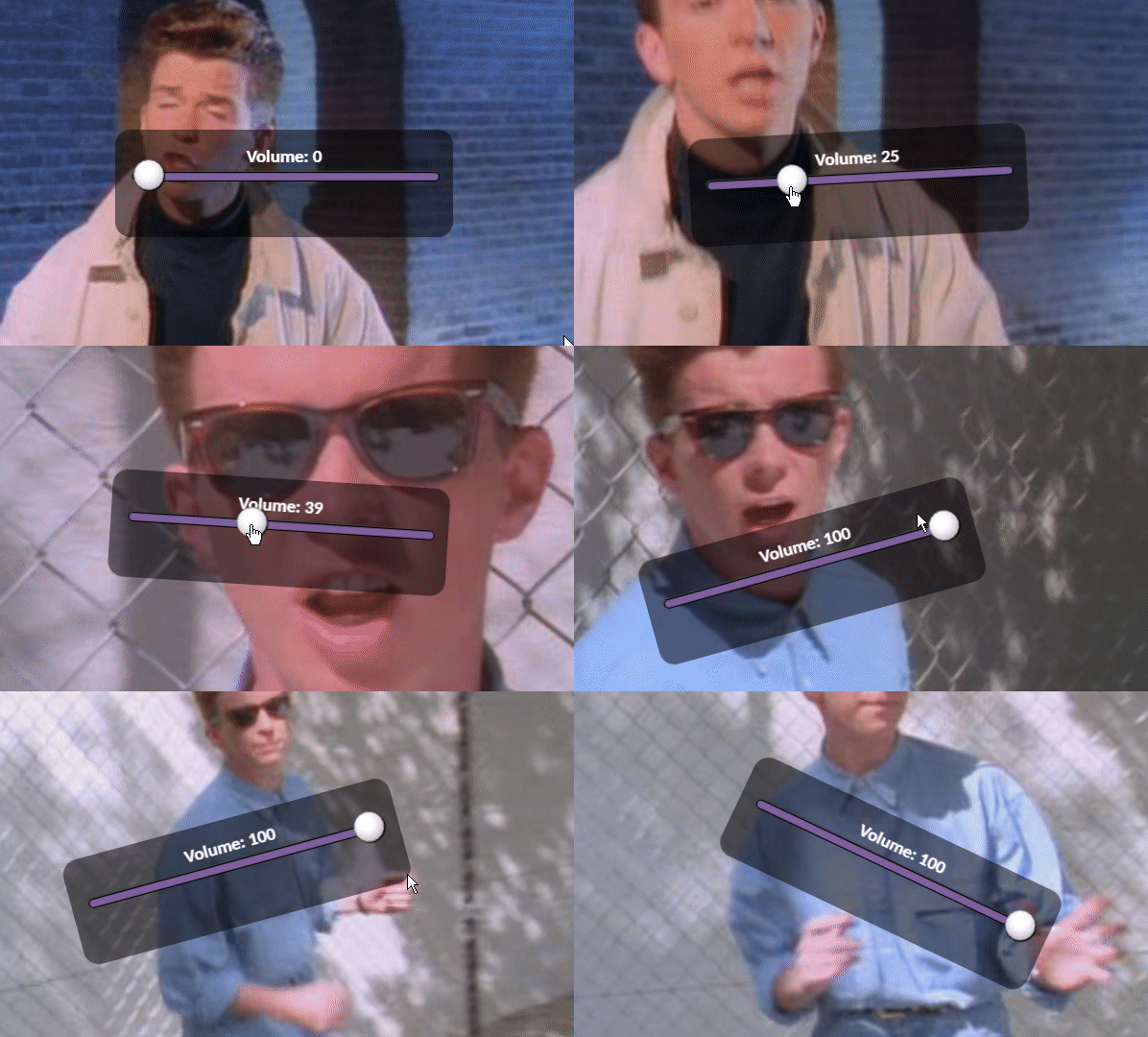
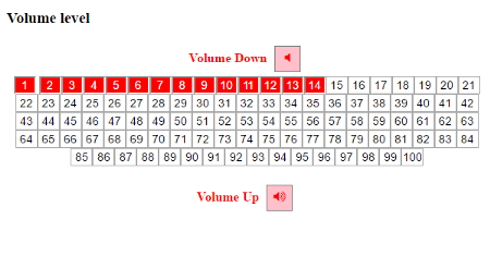
About 「wants」, 「cans」, 「needs」, and 「shoulds」
The original reddit post has now hundreds of examples of terrible volume UI, and it keeps growing — a fun exercise/joke, that can strengthen one』s creative muscles and ability to think outside of the box. People have been participating simply for the fun of coming up with the most absurd and weird interactions and interface elements.But there』s definitely a reflection point about the state our industry here.
I』m sure a lot of people reading this has, at some point in their careers, felt that urge of innovating no matter what. An uncontrollable desire of redesigning something that hasn』t been redesigned for too long. It has to be recreated. And it has to be innovative. Right?
That』s where the wants, cans, needs, and shoulds story comes in.
- Everybody wants to innovate. The design industry keeps nudging us to be creative, innovative, and to deliver design solutions that have never been thought of before. Pressure is on us. We are bombarded with messages telling us that, in order to be considered a solid designer, we have to innovate at any cost.
- A lot of people can innovate. I definitely can redesign the volume control UI. All it takes is a bit of creativity and moderate design skills. Prototyping tools are becoming increasingly accessible, as well as other technologies that allow to bring to fruition whatever idea comes to mind. A few hours in front of Principle or Framer lets you create an extremely refined prototype of the interaction you are envisioning. You can also decide to create an app/site/chatbot to solve that same issue. You can.
- No one needs to. Let』s be honest: the volume control design pattern has been around for decades, works pretty well for the majority of users, and is incredibly familiar to a lot of people. You don』t need to reinvent it.
Should I redesign the volume control UI?
Should is interesting because of its subjectiveness. It』s a question that only makes sense to be asked in first person. And you have to know about much more than just design to be able to answer it — you have to understand about business, technology, culture, people. Answering the should question is a skill you only get after many, many years answering questions alike.
We can try to quantify or measure the should, which makes sense some of the time. But part of it is, and will ever be, intuition. How is yours?
下載開源日報APP:https://openingsource.org/2579/
加入我們:https://openingsource.org/about/join/
關注我們:https://openingsource.org/about/love/

從小到大,我就是反面教材….
哈哈哈哈哈哈哈哈哈哈哈哈哈哈哈哈哈哈哈
今天的日報一定是想笑死我!
😆