每天推荐一个 GitHub 优质开源项目和一篇精选英文科技或编程文章原文,欢迎关注开源日报。交流QQ群:202790710;微博:https://weibo.com/openingsource;电报群 https://t.me/OpeningSourceOrg

今日推荐开源项目:《我居然在 GitHub 上学数学 Awesome Math》传送门:GitHub链接
推荐理由:在 GitHub 上面,不仅有面包,还有数学。这次的这个项目就是收录了包括拓扑,概论与统计和各种分析在内的各种听起来就很复杂的数学知识,对于数学爱好者来说可能很不错,但是如果拿去应付考试的话就……想要拿高分的同学们可以考虑多看看书而不是看这个,顺带一提,这里面还有关于机器学习的智能数学与深度学习两个方面的内容。
今日推荐英文原文:《How to get better at writing CSS》作者:Thomas Lombart
原文链接:https://medium.freecodecamp.org/how-to-get-better-at-writing-css-a1732c32a72f
推荐理由:介绍如何更好的写 CSS 代码的方法
How to get better at writing CSS
Let’s not beat around the bush: writing great CSS code can be painful.
A lot of developers don’t want to do CSS development. I can do everything you want, but nah! No CSS.
When I was building apps, CSS was the part I never enjoyed. But you can’t escape it, right? I mean, we are so focused on the user experience and the design nowadays that we just can’t skip that part.
When beginning a project, all is working fine. You have a few CSS selectors : .title input #app, easy peasy.
But when your app gets bigger and bigger, it starts to look awful. You’re confused about your CSS selectors. You find yourself writing things like div#app .list li.item a. You keep writing the same code over and over again. You throw all your code at the end of your file because you just don’t care, CSS sucks. And there you go: 500 lines of CSS completely unmaintainable.
I have a purpose today: to make you better at writing CSS. I want you to take a look at your older projects and think : oh boy, how could I ever write something like this?
Ok, you might think, you have a point. But what about CSS frameworks? That’s what they stand for, isn’t it? That’s how we write good CSS code.
Sure. But there are some downsides:
- It often leads to commonplace design.
- It can be difficult to customize or go beyond CSS frameworks.
- You have to learn them before using them.
And after all, you landed on this article and there’s a reason for that, right? So without further ado, let’s learn how to get better at CSS.
Note: this is not an article about how to design beautiful apps. It’s about learning how to write maintainable CSS code and how to organize it.
SCSS
I’ll be using SCSS in my examples.
SCSS is a CSS pre-processor. Basically, it is a superset of CSS: it adds some cool features like variables, nesting, imports, and mixins.
I’ll talk about what features we are going to use right away.
Variables
You can have variables with SCSS. The main benefit: reusability. Let’s assume that you have a palette of colors for your app. Your primary color is blue.
So you put blue everywhere: the background-color of your button, the color of your title, links. BLUE EVERYWHERE.
And all of a sudden, you don’t like blue. You prefer green.
- Without variables: change all the lines where you put your blue color.
- With variables: just change the variable 😉
// Declare a variable
$primary-color: #0099ff;
// References a variable
h1 {
  color: $primary-color;
}
Nesting
You can also nest your code with SCSS. So this snippet
h1 {
  font-size: 5rem;
  color: blue;
}
h1 span {
  color: green;
}
can become this:
h1 {
  font-size: 5rem;
  color: blue;

  span {
    color: green;
  }
}
Much more readable, isn’t it? You spend less time writing complex selectors with nesting.
Partials and imports
When it comes to maintainability and readability, it’s impossible to keep all your code in one big file. It can fit your needs when experimenting or building a small app, but at a professional level…don’t even try. Luckily for us, SCSS allows us to do so.
You can create partial files by naming the file with a leading underscore: _animations.scss , _base.scss , _variables.scss , and so on.
As for importing, well use the @import directive. For example, this is what you can do:
// _animations.scss
@keyframes appear {
  0% {
    opacity: 0;
  }
  100% {
    opacity: 1;
  }
}
// header.scss
@import "animations";
h1 {
  animation: appear 0.5s ease-out;
}
Ah! you might think. You made a mistake here! It’s _animations.scss , not animations 😉
Nope. SCSS is smart enough to know you’re talking about a partial file when you name them that way.
And that’s all we need to know about variables, nesting, partials, and import. SCSS has some more features like mixins, inheritance, and other directives ( @for , @if , …) but I won’t cover them here.
If you want to know more about it, check their docs. They’re well-written and easy to understand.
Organizing CSS Code: The BEM Methodology
I can’t remember how many times I used to give catch-all terms to my CSS classes. You know: .button .page-1 .page-2 .custom-input .
We often don’t know how to name things. And yet it’s important. What if you were building an app and you decided for some reasons to set it aside for some months? Or worse, what if someone takes back the project? If your CSS code hasn’t been properly named, it will be hard to know what you’re talking about at a glance.
BEM helps us solving this problem. BEM is a naming convention and stands for Block Element Modifier.
This methodology can make our code structured, more modular, and reusable. Now let’s explain what is a block, an element, and a modifier.
Blocks
Think of the block as a component. Remember when you played Legos as a kid? Well, let’s go back in time.
How would you build a simple house? You’d need a window, a roof, a door, some walls, and that’s it. Well those are our blocks. They are meaningful on their own.
Naming: the block name : .block
Examples: .card , .form , .post , .user-navigation
Elements
Now how would you build a window with your legos? Well maybe some of them look like frames, and when you assemble four of them, you get a beautiful window. Those are our elements. They are the parts of a block, and they are needed in order to build our block. But out of their block, they are useless.
Naming: block name + __ + element name : .block__element
Examples: .post__author ,.post__date ,.post__text
Modifiers
Now that you’ve built your window, you may want to have a green one or a small one. Those are things called modifiers. They are flags on blocks or elements and they are used to change behaviors, apparences, and so on.
Naming: block name OR element name + -- + modifier name: .block__element--modifier , .block--modifierExamples:
.post--important , .post__btn--disabled
Some notes
- When you’re using BEM, you name with classes and only classes. No IDs, no tags. Just classes.
- Blocks/elements can be nested into other blocks/elements, but they have to be completely independent. Remember that word: independent.
So don’t put margins on a button because you want it to be placed under a title, otherwise your button will be tied to your title. Use utility classes instead. - Yes, your HTML file will be overloaded, but don’t worry — it’s a small downside compared to what BEM brings you.
An example
Here is an exercice for you. Go around to your favorite or most used websites and try to think of what would be the blocks, elements, and modifiers.
For example, this is what I imagine on the Google store:
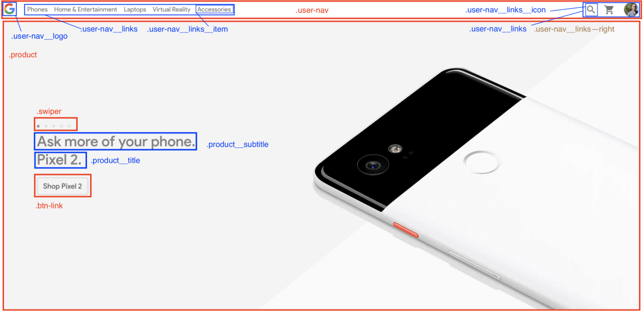
It’s your turn. Be curious and think about what people could have done better. As always, you have to search by yourself, experiment, and create to get better at what you want.
Organizing CSS files: the 7–1 pattern
Still with me? Great! Now let’s see how to organize CSS files. This part will really help you be more productive, and will allow you to instantly find where you have to modify your CSS code.
And to do so, we’ll learn about the 7–1 pattern.
Doesn’t look like anything to me, you might think.
Trust me, it’s fairly simple. You have to follow 2 rules:
- Write all your partials in 7 different folders.
- Import them all in one
main.scssfile located at the root level. And that’s it.
The 7 folders:
base: in here, put all your boilerplate code. By boilerplate, I mean all CSS code you’re gonna write each time you’ll start a new project. For example: typography rules, animations, utilities (by utilities, I mean classes likemargin-right-large,text-center, …) and so on.components: The name is explicit here. This folder contains all the components used to build your pages like your buttons, forms, swipers, popups, and so on.layout: used to layout the different parts of your page, that is to say, your header, footer, navigation, section, your own grid, and more.pages: You may sometimes have a page that has its own specific style, that stands out from what you do usually. Then put your style in thepagesfolder.themes: If you have different themes for your app (dark mode, admin, and so on) put them in this folder.abstracts: Put all your functions here, along with variables and mixins. In short, all your helpers.vendors: what would be an app or a project without external libraries? Put in thevendorsfolder all files that don’t depend on you. You may want to add your Font Awesome file, Bootstrap, and stuff like that in here.
The main file
This is where you’ll import all your partials.
@import abstracts/variables;
@import abstracts/functions;
@import base/reset;
@import base/typography;
@import base/utilities;
@import components/button;
@import components/form;
@import components/user-navigation;
@import layout/header;
@import layout/footer;
...
Yes. It seems overwhelming. But I knew you would think that. This architecture is adapted to larger projects, but not to small ones. So here is a version adapted to smaller projects.
First, you won’t need the vendors folder. Just put all your external CSS code in a link tag placed in a header. Then you can skip the themes folder, as you’ll probably have just one theme for your app. Finally, you won’t have a lot of specific styles for your pages, so you can skip that one too. Great, 4 folders left!
Then, you have two choices:
- You want your CSS code to be organized and follow the 7–1 pattern, so you keep the
abstracts,components,layoutandbasefolders. - You prefer having one big folder where you put all your partials files and your
main.scssfile, so you’ll have something similar to this:
sass/
  _animations.scss
  _base.scss
  _buttons.scss
  _header.scss
  ...
  _variables.scss
  main.scss
It’s up to you.
You convinced me! But how do I use it ? I mean, browsers don’t support scss files do they?
Good catch! This is our final step, and we’re going to learn how to compile SCSS to CSS right away.
From SCSS to CSS
For this, you’ll need Node.js and NPM (or Yarn).
We’ll use a package called node-sass that allows us to compile .scss files to .css files.
Its CLI (Command Line Interface) is fairly easy to use:
node-sass <input> <output> [options]
There are multiple options out there, but we’ll use only two:
-w: watch a directory or a file. It means thatnode-sasswaits for any changes in your code and when they happen, it automatically compiles to CSS. Really useful when developing.--output-style: what will be the output of your CSS file. It can be one among these values:nested|expanded|compact|compressed. We’ll use it to build your CSS file.
If you’re a curious person (which I hope you are, a developer should be curious!), go here for the full docs.
Now we know what tools we’ll use. The rest is even simpler. Just follow these steps:
- Create your project:
mkdir my-app && cd my-app - Initialize it:
npm init - Add the
node-sasslibrary:npm install node-sass --save-dev - Create your folders, your
index.htmland yourmain.scssfiles:
touch index.html
mkdir -p sass/{abstracts,base,components,layout} css
cd sass && touch main.scss
- Add these scripts in the
package.jsonfile:
{
  ...
  "scripts": {
    "watch": "node-sass sass/main.scss css/style.css -w",
    "build": "node-sass sass/main.scss css/style.css --output-style compressed"
  },
  ...
}
- Add the link that contains the reference to your compiled CSS file in the
headtag of yourindex.htmlfile:
<!DOCTYPE html>
<html lang=”en”>
<head>
  <meta charset=”UTF-8">
  <meta name=”viewport” content=”width=device-width, initial-scale=1.0">
  <meta http-equiv=”X-UA-Compatible” content=”ie=edge”>
  <link rel=”stylesheet” href=”css/style.css”>
  <title>My app</title>
</head>
<body>
  <h1 class=”heading”>My app</h1>
</body>
</html>
And that’s it, you’re ready to go! Run npm run watch when you’re coding and open the index.html file in your browser. If you want your CSS to be minified, just run npm run build.
Bonuses
Adding live reload
You may want to add live reload to be even more productive instead of manually reloading your local index.html file.
Once again, follow these simple steps:
- Install the
live-serverpackage:npm install -g live-server
Note: it’s a global package - Add
npm-run-allto your project dependencies:npm install npm-run-all --save-dev: it will allow us to run many scripts at the same time. - Add these scripts to
package.json:
{
  ...
  "scripts": {
    "start": "npm-run-all --parallel liveserver watch",
    "liveserver": "live-server",
    "watch": "node-sass sass/main.scss css/style.css -w",
  },
  ...
}
Now when you run npm run start, you can immediately see your changes without touching anything.
Adding autoprefixer
We set development tools, great! Now, Let’s talk about build tools and especially one : Autoprefixer.
It is a tool (especially a postcss plugin) that parses CSS and add vendor prefixes to CSS rules using values from Can I Use.
Indeed, when you build a website, you may use new features that are not fully supported in all browers. Therefore, vendor prefixes are the solution to add support for these features.
This is an example of what it looks like :
-webkit-animation-name: myAnimation;
-moz-animation-name: myAnimation;
-ms-animation-name: myAnimation;
You guessed it, it’s tedious to write. That’s why we need autoprefixer to make our CSS code compliant with browsers without adding an extra layer of complexity.
So what we’ll do code-wise to build our CSS is :
- Compile all our SCSS files into one main CSS file.
- Prefix our CSS file with Autoprefixer.
- Compress our CSS file
This will be the last steps, so bear with me, you’re nearly done ?
- Add two dependencies,
postcss-cliandautoprefixer:npm install autoprefixer postcss-cli --save-dev - Modify the
buildscript and add these scripts topackage.json:
{
  ...
  "scripts": {
    "start": "npm-run-all --parallel liveserver watch",
    "liveserver": "live-server",
    "watch": "node-sass sass/main.scss css/style.css -w",
    "compile": "node-sass sass/main.scss css/style.css",
    "prefix": "postcss css/style.css --use autoprefixer -o css/style.css",
    "compress": "node-sass css/style.css css/style.css --output-style compressed",
    "build": "npm-run-all compile prefix compress"
  ...
}
Now when you runnpm run build , your CSS code is compressed and vendor prefixes have been added! Awesome isn’t it?
But you know what’s even more awesome? I set up a repo for you just in case you want to quickly get started ?
If you want to know how I apply these skills to my portfolio, check out this repo too and the result. I hope you will understand more with those examples.
Aaaaaand, that’s all for today! Now you’re ready to write maintainable, modular, and reusable CSS code.
I hope you liked this article. If so, feel free to give me feedback in the comments. Bye bye until next time!
每天推荐一个 GitHub 优质开源项目和一篇精选英文科技或编程文章原文,欢迎关注开源日报。交流QQ群:202790710;微博:https://weibo.com/openingsource;电报群 https://t.me/OpeningSourceOrg
