每天推荐一个 GitHub 优质开源项目和一篇精选英文科技或编程文章原文,欢迎关注开源日报。交流QQ群:202790710;微博:https://weibo.com/openingsource;电报群 https://t.me/OpeningSourceOrg
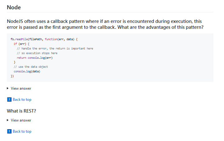
今日推荐开源项目:《面试可能用的到的 30 Seconds of Interviews》GitHub链接
推荐理由:这个项目搜集了关于 Web 前端的面试知识,就是 HTML ,JavaScript , CSS ,Node (虽然有点少)和安全性(很少)四个方面。虽然这些都是面试中的问题,但是如果你想要试试看自己对前端了解多少,也可以来试着回答这些问题,然后展开答案看看有何不同,兴许以后就用上了呢。
今日推荐英文原文:《7 Basic Rules for Button Design》作者:Nick Babich
原文链接:https://uxplanet.org/7-basic-rules-for-button-design-63dcdf5676b4
推荐理由:设计按钮的基本准则,最起码有了这个你设计的按钮会让人用起来舒服不少,虽然现在大多数人应该都在遵守这个准则……
7 Basic Rules for Button Design
Buttons are an essential element of interaction design. They have a primary role in the conversation between a user and the system. In this article, I’ll review seven basic principles you need to know to create effective buttons.
1. Make buttons look like buttons
When it comes to interacting with user interface, users need to know instantly what is ‘clickable’ and what’s not. Every item in a design requires effort by the user to decode. Generally, the more time needed for users to decode the UI the less usable it becomes for them.
But how do users understand whether a certain element is interactive or not? They use previous experience and visual signifiers to clarify the meaning of the UI object. That’s why it so important to use appropriate visual signifiers (such as size, shape, color, shadow, etc.) to make the element look like a button. Visual signifiers hold an essential information value — they help to create affordances in the interface.
Unfortunately, in many interfaces the signifiers of interactivity are weak and require interaction effort; as a result, they effectively reduce discoverability.
If clear affordances of interaction are missing and users struggle with what is “clickable” and what is not, it won’t matter how cool we make the design. If they find it hard to use, they will find it frustrating and ultimately not very usable.
Weak signifiers is an even more significant problem for mobile users. In the attempt to understand whether an individual element is interactive or not, desktop users can move the cursor on the element and check whether the cursor changes its state. Mobile users don’t have such opportunity. To understand whether an element is interactive or not users have to tap on it — there’s no other way to check the interactivity.
Don’t assume that something in your UI is obvious for your users
In many cases, designers intentionally don’t identify buttons as interactive elements because they assume the interactive elements are obvious for users. When designing an interface, you should always keep in mind following rule:
Your ability to interpret clickability signifiers aren’t the same as your users’ because you know what each element in your own design is intended to do.
Use familiar designs for your buttons
Here are a few examples of buttons that are familiar to most users:
- Filled button with square borders
- Filled button with rounded corners
- Filled button with shadows
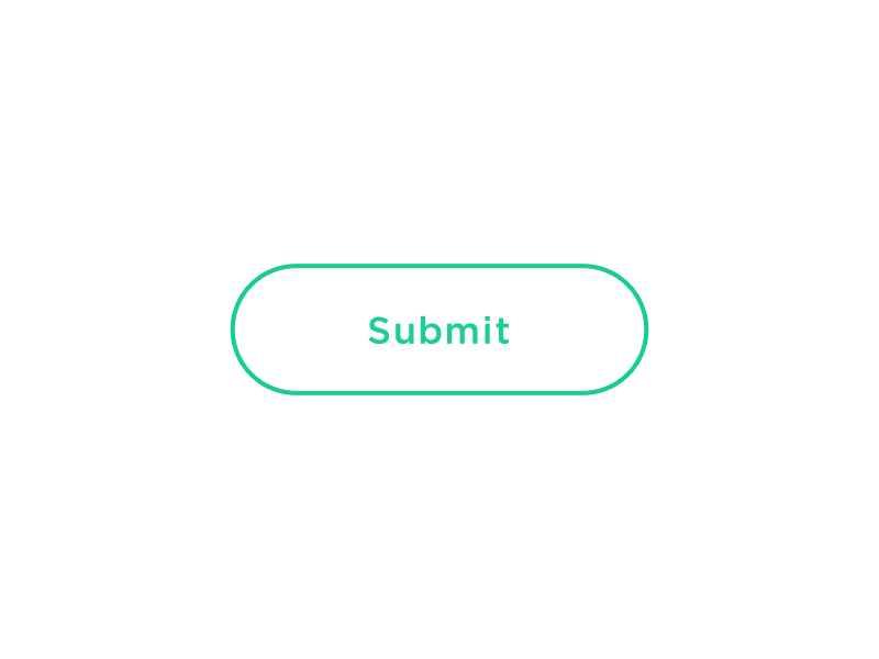
- Ghost button
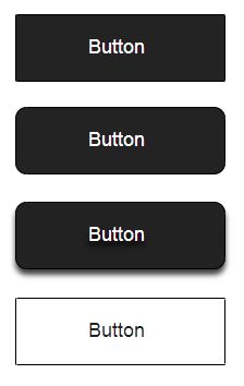
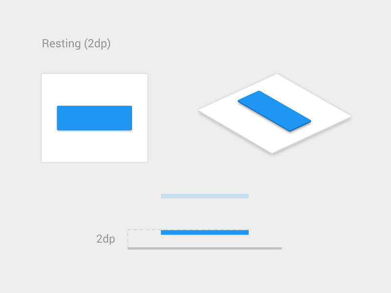
Among all those examples, the “Filled button with shadows” design is the clearest for users. When users see a dimensionality of an object, they instantly know that it’s something they can press.
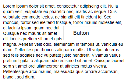
Don’t forget about the whitespace
Not only the visual properties of the button itself are important. The amount of whitespace near the button makes it easier (or harder) for users to understand whether it’s an interactive element or not. In the example, below some users might confuse the ghost button with an information box.
2. Put buttons where users expect to find them
Buttons should be located in places where users can easily find them or expect to see. Don’t make users hunt for buttons. If users can’t find a button, they won’t know that it exists.
Use traditional layouts and standard UI patterns as much as possible
Conventional placement for buttons improves discoverability. With a standard layout, users will easily understand the purpose of each element — even it’s a button without strong signifiers. Combining a standard layout with clean visual design and ample whitespace makes the layout more understandable.
Don’t play hunt-the-button game with your users
Tip: Test your design on discoverability. When users first navigate to a page that contains some actions that you want them to take, it should be easy to spot an appropriate button for the user.
3. Label buttons with what they do
Buttons with generic or misleading labels can be a huge source of frustrations for your users. Write button labels that clearly explain what each button does. Ideally, the button’s label should clearly describe its action.
Users should clearly understand what happens when they click on a button. Let me give you a simple example. Imagine that you accidentally triggered a delete action and now you see the following error message.
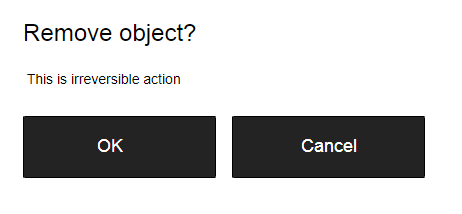
It’s not clear what does ‘OK’ and ‘Cancel’ represent in this dialog. Most users will ask themselves “What happens when I click on ‘Cancel’?”
Never designed a dialog box or form that consisted solely of the two buttons ‘OK’ and ‘Cancel’.
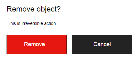
Instead of using ‘OK’ label it’s better to use ‘Remove.’ This will make it clear what this button does for the user. Also, if ‘Delete’ is a potentially dangerous operation, you can use red color to state this fact.
4. Properly size your buttons
Button size should reflect the priority of this element on the screen. Large button means more important action.
Prioritize buttons
Make the most important button look like it’s the most important one. Always try to make the primary action button more prominent. Increase its size (by making a button bigger you make it look more important for users) and use a contrasting color to capture user attention.

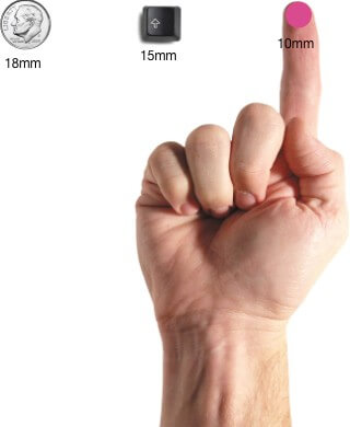
Make buttons finger-friendly for mobile users
In many mobile apps, buttons are too small. This often leads to the situation when users mistype.
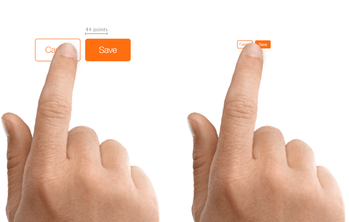
MIT Touch Lab study found that averages for finger pads are between 10–14mm and fingertips are 8–10mm. This makes 10mm x 10mm a good minimum touch target size.
5. Mind the order
The order for buttons should reflect the nature of a conversation between the user and the system. Ask yourself, what order users expect to have on this screen and design accordingly.
User interface is a conversation with your users
For example, how to order ‘Previous/Next’ buttons in pagination? It’s logical that a button that moves you forward should be on the right, and a button which moves you backward should be on the left.
6. Avoid using too many buttons
This is a common problem for many apps and websites. When you provide too many options, your users end up doing nothing. When designing pages in your app or website, think about the most important actions you want your users to take.
7. Provide visual or audio feedback on interaction
When users click or tap on the button, they expect that the user interface will respond with appropriate feedback. Based on the type of operation, this might be either visual or audio feedback. When users don’t have any feedback, they might consider that the system didn’t receive their command and will repeat the action. Such behavior often causes multiple unnecessary operations.
Why is this happening? As humans, we expect some feedback after we interact with an object. It might be visual, audio or tactile feedback — anything that acknowledges the fact that interaction was registered.
For some operations, such as downloading, it’s worth not only acknowledging user input but also show a current state of the process.
Conclusion
Despite the fact that buttons are an ordinary element of interaction design, it’s worth putting a lot of attention to make this element as good as possible. Button UX design should always be about recognition and clarity.
Thank you!
每天推荐一个 GitHub 优质开源项目和一篇精选英文科技或编程文章原文,欢迎关注开源日报。交流QQ群:202790710;微博:https://weibo.com/openingsource;电报群 https://t.me/OpeningSourceOrg