开源日报每天推荐一个 GitHub 优质开源项目和一篇精选英文科技或编程文章原文,坚持阅读《开源日报》,保持每日学习的好习惯。
2024年2月21日,开源日报第1112期:
今日推荐开源项目:《query》
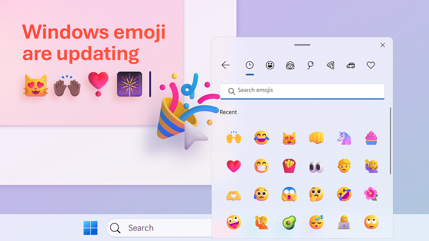
今日推荐英文原文:《Bringing new emoji to Windows 11 》
开源项目
今日推荐开源项目:《query》传送门:项目链接
推荐理由:🤖 强大的异步状态管理、服务器状态工具和网络数据获取: TS/JS,React Query,Solid Query,Svelte Query 和 Vue Query
直达链接: tanstack.com/query/latest
英文原文
今日推荐英文原文:Bringing new emoji to Windows 11
推荐理由:文章微软如何设计新的表情符号并将其集成到Windows 11中,其实表情符号也是一种重要的沟通方式,在日常和工作中都很常用,微软对这方面的创新也是难能可贵
Bringing new emoji to Windows 11
A look at how we designed a new dimension of expression
By Tracy Jones
Read the full article on our new website.
Why are emoji significant? They’re symbols of the future that rhyme with the past. Human communication started with cave paintings, followed by the printing press, telephone, radio, TV, and the internet. But in an ever more interconnected world with less in-person interaction, emoji have become an integral part of communication. According to a 2013 study, the face of an emoticon (the text-based predecessor of emoji) activates the same parts of our brain that recognize faces.
While that may seem trivial, it’s actually a remarkable feat of the human brain. Unlike natural stimuli, emoji are cultural inventions that have acquired meaning and emotion through social interactions. Our neural circuits adapting to such novel forms of communication shows the plasticity and versatility of our cognition. Expression through emoji isn’t static either, it continually changes with technology and context.
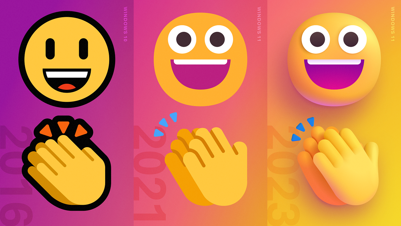
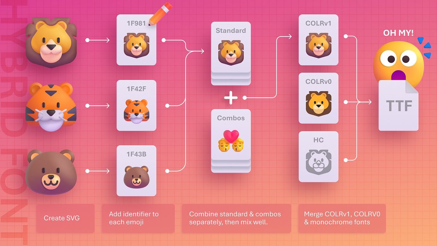
Since launching 2D Fluent emoji for Windows in 2021, our design teams have continued evolving this unique visual language. This month, we unveiled the next iteration of the Windows 11 Segoe UI Emoji font, a bright and bold collection inspiring people to play, engage, and express themselves like never before. With the creation of a hybrid font, an extension of our color font technology, Microsoft designers embraced dimension to create the visual appearance of stylized physical objects with real-world material qualities. The process of creating 3D Fluent emoji elucidates the power of innovating within design constraints and designing in the open via cross-industry collaboration.
Our history with emoji
Customer feedback fueled our motivation to keep iterating on the visually flat emoji we introduced in 2021. But bringing our more dimensional emoji to life would require numerous disciplines and talent from across the company. This endeavor was a way of expanding our collaboration efforts. Microsoft and Windows have a long legacy in the font space dating back to 1985, but the challenging task of updating the Segoe UI emoji would alter our approach to designing color fonts.
When Unicode published emoji just after 2010, they were in-line with text. The expressive nature emoji called for a font that could define multiple colors in a single glyph. Every tech company was grappling with how to represent and support emoji. In 2013, for Windows 8.1, we adopted COLRv0, an OpenType-based font format that supports color glyphs, alpha blending, and overlapping glyph layers (or z-order). “We looked at how people had been using fonts on the web for things like app icons or logos and where else they would use them,” said Principal Program Manager Peter Constable.
For the 2D Fluent emoji, we chose COLRv0 because the format was easy to define and implement. It was scalable and used a small file size. The simplicity of the design attracted other companies, making COLRv0 the standard for supporting flat 2D color images. But as emoji fonts using color bitmaps evolved, their file sizes grew. COLRv0 couldn’t scale or support a high number of layered glyphs and solid color fills, including large bitmap 3D images. This problem of integrating our simulated 3D emoji was a perfect opportunity to design a way for art and science to meet on common ground.
Shadow, light, and color are the new 3D
“Our operating system would’ve needed to render, shape, create, and scale large bitmap designs to maintain consistency across applications. Problem was, the available technology was either obsolete or impractical. Plus, we couldn’t test or validate if it worked”, said Spencer Nelson. Spencer was the principal UX Engineer Manager responsible for helping to systematize the font. Microsoft had to design a workaround that would be the perfect substitute and just as emotive.
To solve this dilemma, we implemented COLRv1, a successor to COLRv0 that uses gradients in a way that rivals 3D. COLRv1 is paradoxically ethereal, more sensitive, and, like humanity, full of light and inherently social. Since Peter helped develop COLRv1, he joined the emoji effort. “Integrating the images into text layout already addresses a number of engineering issues. If you wanted to use SVG or PNG, there’s a bunch of other engineering work that we would’ve had to consider,” Peter said. COLRv1 is a new font format that enables gradients, transformations, compositing, and other effects. This means that color fonts can have more depth, dimension, illumination, and creative possibilities. And unlike large bitmaps, COLRv1 scales easily.
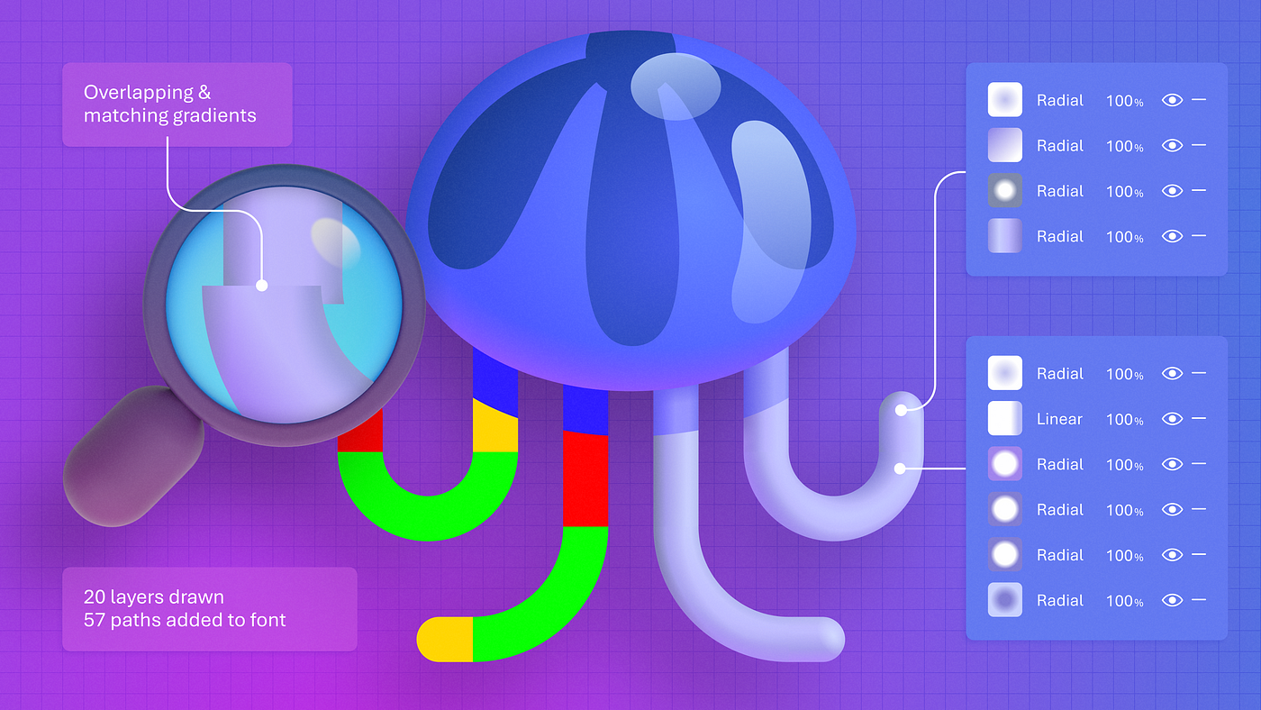
Ultimately, we updated over 3,000 emoji to support the COLRv1 format, combining efforts of around 20 designers from across the company. Principal Product Designer Jason Custer was responsible for developing guidelines and tutorials for recreating our emoji. In the early stages of this effort to reimagine our emoji, the team turned to gradients, blurring, and drop shadows to create 3D lighting.
“We would draw a line or shape and then blur it so that it looked like it was a reflection,” said Jason. At first, they tested 50 emoji with blurred vector shapes, but they had to keep iterating. “Blending modes like overlay or multiply, adding effects like drop or inner shadows, any typical treatments for images you can think of, didn’t work for the font,” said Jason. He and his designer cohorts layered gradients on top of gradients, trying to create the illusion of depth and dimension. Through trial and error, they simulated stylized physical objects into 3D-style emoji using strictly linear and radial gradients, all of them vectors and infinitely scalable. The result gave shape to light in the form of emotive fonts. Additionally, they created 2D and monochrome versions of each emoji.
At this point, the new Segoe UI emoji had to be integrated into the OS, but how? “You need the software to be able to display these things, but we also need tooling to be able to generate the font data,” Peter said. Enter Google Tech Lead Rod Sheeter and Adobe’s Senior Computer Scientist Josh Hadley.
Birth of the hybrid font
Spencer and his engineering crew worked closely with Rod and Josh to make our highly anticipated font update a reality. At Google, they developed a tool called nanoemoji that was essential to developing our glyphs, allowing us to transform the designers’ SVG artwork into the COLRv1 data format. Josh, who understood the logic Spencer’s team needed to integrate our new font into Windows, assisted with an open-source tool called AFDKO (Adobe Font Development Kit for OpenType) that we used to add required processing logic into OpenType Layout tables in the font. The multi-company collaboration across Josh, Rod, and Spencer’s teams culminated in the creation of a hybrid font.
We’re referring to this new font as a hybrid because it contains COLRv1, COLRv0, and monochrome glyphs. If an application supports COLRv1, the font displays COLRv1; if not, then the application uses one of the other two versions. A hybrid font is a revolving door of adaptability and different styles. “It’s pretty groundbreaking. Nobody in the world is currently shipping a font that does this,” said Senior Program Manager Judy Safran-Aasen, who oversees the font and emoji work as part of the Windows operating system. It’s exciting to consider where designers will take hybrid fonts next. Their creation shows the importance of leaving room for discovery and experimentation in design journeys.
Our new emoji are not only a product of technical innovation but also a reflection of our values and vision. We wanted to create a font that celebrates life, vibrancy, and dimension. Just like with our open-source emoji, we want our customers to represent themselves in authentic ways. Our new emoji are designed to be fun, colorful, and engaging, but also versatile, adaptable, and universal.
“It was a really awesome project to bring in a lot of designers across Microsoft. We would have these little emoji jams, and people just kind of helped out. It was a company effort to rally around some of our most delightful interactions,” said Windows Principal Art Director Cassie Klinger. We hope you enjoy the updated Segoe UI Emoji fonts. With these new ways to communicate, we aim to inspire creativity, connection, joy, and beyond.
下载开源日报APP:https://openingsource.org/2579/
加入我们:https://openingsource.org/about/join/
关注我们:https://openingsource.org/about/love/