开源日报每天推荐一个 GitHub 优质开源项目和一篇精选英文科技或编程文章原文,坚持阅读《开源日报》,保持每日学习的好习惯。
开源日报第1083期:Next.js实现购物平台项目:《c-shopping》
2024年1月23日,开源日报第1083期:
今日推荐开源项目:《c-shopping》
今日推荐英文原文:《Mastering React Portal in 2024》

开源项目
今日推荐开源项目:《c-shopping》传送门:项目链接
推荐理由: 一个使用Next.js开发的精美购物平台,专为包括桌面、平板和手机在内的各种设备量身定制
网站直达:shop.huanghanlian.com
英文原文
今日推荐英文原文:Mastering React Portal in 2024
推荐理由:React Portal 在解决模态框等场景中的问题时具有强大的功能,通过创建两个不同的层次结构,一个用于组件,另一个用于在 DOM 上进行样式和定位,Portal 实现了逻辑和显示的分离
Mastering React Portal in 2024
Today, let’s explore the power of React Portals. 🚀
Every React developer already had to handle some of the following situations:
Positioning a modal outside the parent component.
Creating some “out of the screen” functionality, such as a Toast handler, or Chat App.
When building some popup that covers the entire screen and is reused on several pages.
Now, despite which problem you had, I bet you resorted to this solution 😅:
1 — Make the modal appended to the main HTML document **position:absolute** or **position:fixed**
2 — Control CSS cascading **z-index** by setting values to each component on your screen.
This solution may sound solid, but there are several drawbacks:
You can’t always separate the styling from the parent component from the child (modal), especially if you are reusing the same modal on several pages. Think about a Chat App or some popup.
If you have several configurations of
**z-indexes**on several pages, you will probably have to randomly select indexes that make what you want. This is terrible for code reusability.Another problem with z-index is that the stacking order depends also on the stacking context, making it hard to use when your scope starts to scale.
Your code and your styling have the same parent-child relation when it’s not really what you want. This isn’t good for code readability and separation of concerns.
Event Bubbling may become an issue. CSS positioning may not always propagate as expected.
I think you got it. Now, what can we do?
Well, React provides a cleaver way to solve all these problems with a simple approach: Portals
What Are Portals?
A Portal is a functionality in React that allows you to create two different hierarchies: one for your components (normal tree-like structure), and the other for your styling and positioning on the DOM (Document Object Model). That way, you can separate what is being from what is shown.
As the React Documentation states:
A portal only changes the physical placement of the DOM node. In every other way, the JSX you render into a portal acts as a child node of the React component that renders it.
And how to use it? The main instruction to create a Portal is:
createPortal(children, domNode, key?)Where:
· children are all components that compose your modal.
·
**domNode**is the element on your DOM that will be used to display your component.· key (optional), used as a unique ID for your portal.
And this command returns a React Node, that can be included in your JSX. Imagine this syntax as a kind of a flag: when React finds it, it’s indicative that its children must be rendered related to the domNode, and not respecting the JSX hierarchy.
Just one additional concern is regarding event propagation: despite being rendered on the domNode, events will still follow the JSX tree logic.
How to use Portals
Now we are going to learn how to use it. We will create a new React project together. I am assuming you already have Node.js and npm installed 🛠️.
To simplify the styling process, we will be using TailwindCSS. Open your Terminal and type:
npx create-next-app@latestThen name it toast-demo, Yes to Typescript, Yes to TailwindCSS, and Yes to the src directory
Now, cd **toast-demo**, then open the project (I am using VS Code)
Inside the folder **src/pages**, open the **index.tsx** file and change it’s **Home** function to this:
import { useState } from "react";

export default function Home() {
  //Simple state. used to switch between open and closed modal
  const [openModal, setOpenModal] = useState(false);

  //Our Modal. Still not using React Portal
  //It will only display if the openModal state is TRUE.
  const modal = openModal && (
    <div className='bg-red-200 rounded-full p-4'>
      Hello! I am the Portal!
    </div>
  );

  //Our return statement
  return (
    // Our main div. It's covering the entire screen, and keeping the elements in a flex column.
    <div className="fixed w-full h-full flex flex-col items-center justify-center bg-white text-black gap-4">
      {/* Just Text */}
      <p>This is the click me parent section</p>
      {/* Our button, that opens the modal */}
      <button
        className="bg-blue-400 rounded-full p-4 cursor-pointer"
        onClick = {() => {setOpenModal(!openModal)}}>
        Click Me to open the Modal
      </button>

      {/* Our modal. It's not using portals yet. */}
      {modal}
    </div>
  );
}
Just a brief explanation. We are creating a main element that is fixed and covers the entire screen. It has a text element and a button, both one below the other. We are including some configuration, a text color, and a background color. We are also adding the cursor-pointer on the button for future use.
Now let’s run. Type the following command and open the **localhost** on your browser:
npm run devAnd you should see the text, the button. If you click the button, the modal will appear below the other two elements, as expected. If the inspect, we should see the following:
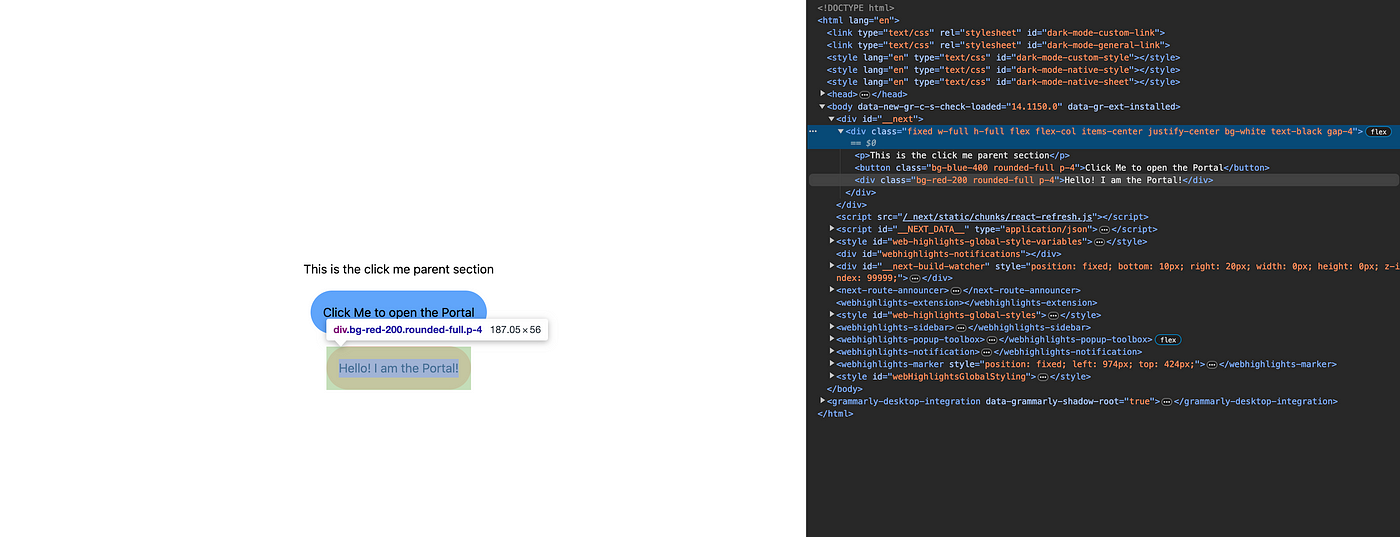
JSX tree structure vs DOM structure — No Portals
As we can see, the hierarchy is preserved both in JSX and in the DOM. Our modal div is under the main **<div>**, and has the **<p>** and the **<button>** as its siblings.
Now we are going to add our Portal. Change the code to the following:
import { createPortal } from "react-dom";

...

const modal = openModal && (
  createPortal(<div className='fixed bg-red-200 rounded-full p-4'>
    Hello! I am the Portal!
  </div>, document.body) //We are using the DOM body as our
);
This time, if you run the code, you will see the following:
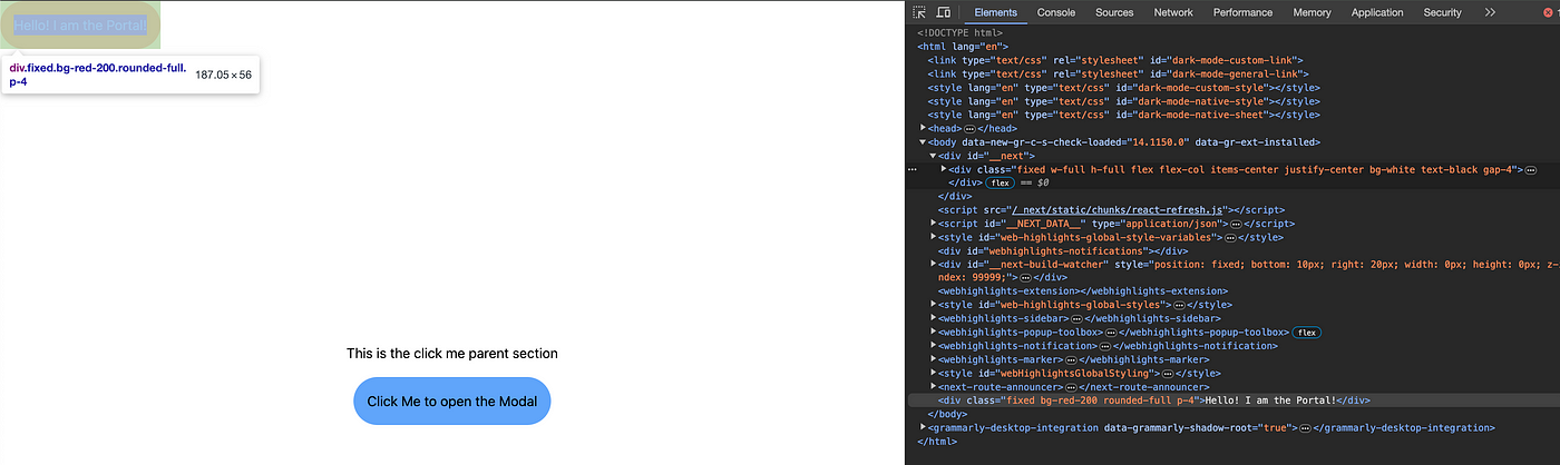
JSX tree structure vs DOM structure — With the use of Portals
Look closely. A couple of important things are happening here:
- Now, despite our modal still being inside our main
**<div>**element on JSX, it’s being rendered right under the document**<body>**, having our main**<div>**as a sibling instead of a parent. - It’s being displayed anywhere else, as we haven’t added much styling to it. As it’s at the bottom of the
**<body>**, it is being displayed on top of our main**<div>**. - Last but not least, notice that the text color is not black anymore, but the default white from the NextJS project. It happens because, as we talked about previously, our portal doesn’t have to comply with its JSX parent styling, and only responds to what the document
**<body>**tells it.
As you can see, React Portals allow us to separate concerns regarding code logic and the DOM disposition. With this approach in mind, we can create modals that are reusable and can be instantiated on several pages with minor to no changes. Let’s finish this first part with a demonstration of how we can handle event propagation.
We can do this in several ways, but I will keep it simple and use **pointer-events-none** it to ignore mouse events. That said, change your modal code to the following:
  //Our Modal. Now with React Portals
  //We are adding the pointer-events-none to our main div, in order to make it ignore pointer events.
  const modal = openModal && (
    createPortal(<div className='fixed w-full h-full bg-black bg-opacity-[80%] bg-red-200 flex items-start justify-center pointer-events-none'>
      <div className="p-8 mt-8 bg-white rounded-full text-black">
        I am a Portal, but I am also invisible to mouse clicks!
      </div>

    </div>, document.body) //We are using the DOM body as our
  );
The use of **pointer-events-none** ensures that the modal ignores mouse events, allowing interaction with the elements behind it. This is particularly useful when you want to create a modal overlay that doesn't interfere with elements beneath it.
And run. Now you can see that you are still able to close the Portal by clicking the button. And if you hover over the button, the cursor will still change.
Okay, I think you know almost everything there is to know about React Portals to start using it. I just want to finish with one last (and not very used, I must agree) feature of React Portals, which is the rendering element.
Did you notice that we used **document.body** our Portal’s parent element? Well, we can change it if you want to. You can use some component’s reference or name.
// Our Modal. Now with React Portals using a custom rendering element.
const modal = openModal && (
  createPortal(
    <div className='fixed bg-red-200 rounded-full p-4'>
      Hello! I am the Portal!
    </div>, document.getElementById("your-element-id"))
);
And add the **property id** to the element you want.
And that’s it for today. I hope now you understand how to use React Portals and start using them on your next modal.
Looking forward to seeing you soon! 👋
下载开源日报APP:https://openingsource.org/2579/
加入我们:https://openingsource.org/about/join/
关注我们:https://openingsource.org/about/love/