开源日报每天推荐一个 GitHub 优质开源项目和一篇精选英文科技或编程文章原文,坚持阅读《开源日报》,保持每日学习的好习惯。
2024年1月16日,开源日报第1076期:
今日推荐开源项目:《danswer》
今日推荐英文原文:《React Custom Hook: Hovering Made Easy with useHover》

开源项目
今日推荐开源项目:《danswer》传送门:项目链接
推荐理由: danswer可以自然语言提问并获得由私人来源支持的答案,并通过引用和参考来源材料获得可靠答案,连接到诸如Slack、GitHub、Confluence等工具
官网直达:https://docs.danswer.dev
英文原文
今日推荐英文原文:React Custom Hook: Hovering Made Easy with useHover!
推荐理由:这篇文章介绍了如何创建和使用自定义 React Hook,名为 useHover,用于检测元素悬停状态,通过 useState 管理悬停状态,useEffect 添加悬停事件监听器,使其可在不同组件中重用,比较实用的 hook
React Custom Hook: Hovering Made Easy with useHover!
Hey there, fellow React enthusiasts! Today, we’re diving into the world of custom hooks and learning about one of the most useful ones: useHover.
If you're new to React or just starting your journey, don't worry!
We'll take it step by step and make sure you understand everything with plenty of examples.
What’s a Custom Hook?
First things first, what’s a custom hook? In React, a custom hook is simply a JavaScript function that starts with the word “use” and lets you hook into React state and lifecycle features from functional components.
Think of them as a way to reuse stateful logic across different components.
Custom hooks can be a real lifesaver when you find yourself repeating the same logic in multiple places.
Today, we’re going to create a custom hook called useHover that will help us detect when an element is being hovered over.
The useHover Hook
Here’s a simple use case for our useHover hook: Let's say you have a button, and you want to change its color when a user hovers over it.
We could write this behavior in a custom hook to make it reusable. Here's how you can create the useHover hook:
import { useState, useEffect } from 'react';

function useHover() {
  const [isHovered, setIsHovered] = useState(false);

  const handleMouseEnter = () => {
    setIsHovered(true);
  };

  const handleMouseLeave = () => {
    setIsHovered(false);
  };

  useEffect(() => {
    const element = document.querySelector('.hover-element'); // Replace with your element selector
    element.addEventListener('mouseenter', handleMouseEnter);
    element.addEventListener('mouseleave', handleMouseLeave);

    return () => {
      element.removeEventListener('mouseenter', handleMouseEnter);
      element.removeEventListener('mouseleave', handleMouseLeave);
    };
  }, []);

  return isHovered;
}
Here’s a breakdown of what’s happening:
- We import the necessary React hooks,
useStateanduseEffect. - Inside the
useHoverfunction, we initialize a state variable,isHovered, and two event handlers,handleMouseEnterandhandleMouseLeave. - We use the
useEffecthook to add event listeners formouseenterandmouseleaveevents to the specified element (you'll need to replace.hover-elementwith your own selector). These event listeners will call our event handlers when the mouse enters and leaves the element. - We return the
isHoveredstate variable. This tells us whether the element is currently being hovered over or not.
Using the useHover Hook
Now that we have our useHover hook ready, let's see how we can use it in a functional component:
import React from 'react';
import useHover from './useHover'; // Import our custom hook

function HoverExample() {
  const isHovered = useHover();

  const buttonColor = isHovered ? 'blue' : 'red';

  return (
    <button
      className="hover-element"
      style={{ backgroundColor: buttonColor }}
    >
      Hover me!
    </button>
  );
}

export default HoverExample;
Here’s what’s happening in the HoverExample component:
- We import our custom hook
useHoverat the top of the file. - Inside the
HoverExamplecomponent, we calluseHover(), which gives us theisHoveredvalue. - We use the
isHoveredvalue to determine the button's background color. IfisHoveredistrue, we set the color to blue; otherwise, it's red. - Finally, we render a button element with the class name
hover-elementand apply the dynamic background color based on the hover state.
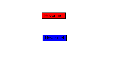
Result:
Wrapping Up
And that’s it! You’ve just created and used your own custom hook, useHover, to add hover functionality to a button.
The beauty of custom hooks is that you can reuse them across different components, making your code more readable and maintainable.
Custom hooks are a powerful tool in your React toolbox. They allow you to abstract away complex logic and provide a clean API for your components.
So, go ahead and create your custom hooks for various use cases, and level up your React development skills.
Happy coding! 😄🚀
下载开源日报APP:https://openingsource.org/2579/
加入我们:https://openingsource.org/about/join/
关注我们:https://openingsource.org/about/love/